Tenant Settings
Tenant Settings will allow you to customize the behavior of the current tenant based on the requirement.
Tenant settings link is available on the left navigation link as shown below.

It has two sections
1)Basic Settings
2)Beta Version
Basic Settings
Basic Settings has the following features.
Enable Quick Menu
By enabling this option, the quick menu will be displayed for controls in Designer as shown in the image below. A quick menu provides an easy way to access the frequently used properties for the control.

Eg: Quick menu of the Textbox control
Security
In this feature, Security checking can be enabled or disabled. For better performance, turn it off if not using this feature. By enabling this feature Manage security option appears on Form Explorer and form as shown in the images below.


- Data Form Settings
The Data Form Settings feature will enable DataForm features for this tenant. On enabling these settings, Data Form will be available on the Create Form Window near Blank Form as shown below.

- DataForm Trail Settings:
On enabling DataForm Trail Settings, DataForm Trail features will be enabled form this tenant
- Custom Error Description:
This feature is used to enable custom error instead of the default one. This feature is tenant specific.
On enabling this feature, a textbox appears as shown below.

The custom error text can be given in this textbox and click update button. So, the custom error text which is typed in this textbox will be shown instead of default error.
- Maintenance Mode Settings:
Maintenance Mode Settings will allow to manage maintenance mode on current tenant
On Clicking the Manage button, the Maintenance Mode window appears as shown below.

Enable Maintenance Mode so that disabled maintenance mode window becomes enabled.
It has three sections
- Custom Form
In this Section, either a Custom form to be displayed on Maintenance mode can be selected or default form with custom message will be displayed. In order to select the form which needs to be displayed on maintenance mode can be selected by clicking the browse button. On clicking browse button, a window to select form appears as shown below.

In this window, Expand All is used to expand all the folder, find option helps to find the form by typing the form name in textbox and select the required form and click Ok button.
- Custom Message
In this section, required custom message can be entered the provided textbox that will be displayed in the default form in Maintenance mode. By default, it will be “Under construction. Please try again later”
- Exempted Users/Groups
In this section, the users or groups to be exempted can be selected.
Enter the login ID in the given textbox and click + button. On clicking + button, the user will be exempted and the user who is exempted will be displayed in the table below.
The Table displays the User Login ID, Display Name and type of user as shown in the image below.

If you want to delete the user from the table, Click Delete icon provided for each user or group.
Finally click the Save button. A confirmation Popup appears as shown below,

Click Ok to save the details.
Click Home, and the default maintenance mode page will come as shown below.

7.Slide Panel Settings:
This setting enables you to manage the slide panel for the current tenant. Click the “Manage” button, and the Slide Panel Window will appear as shown below. Enable the Slide Panel configuration to activate the previously disabled slide panel window. You can choose the form to display on the slide panel in the “Form Path” section by clicking the “Browse” button. The “Select Form” window will then appear as shown below.

Select the desired form and click “OK.” The “Select Form” window will close, and then click the “Save” button on the Slide Panel window. A confirmation message will appear as shown below.

Click Ok, click Home, sliding panel icon appears as shown below.

On Clicking Sliding Panel icon, the configured form on Sliding panel appears as shown below

- Show WorkFlow Link
This feature is used to Show or Hide Workflow Link. On enabling this feature, WorkFlow link appears as shown below

9.Apply Security on Global Menu
This feature is used to enable or disable security on Global Menu.
10.Apply Security on Navigation
Enable this feature to apply security on Navigation.
11.Password Policy
This setting will allow you to customize the strength of password while creating user. Click Manage button, Password Policy window appears as shown below.

Three Types of password strength can be selected.
1.Normal – Password can be of any length and combinations.
2.Medium-Password must be of minimum length 6, containing atleast 1 capital letter, 1 small letter and 1 digit in it.
3.Strong- Password must be of minimum length 8, containing atleast 1 capital letter,1 small letter and a special character in it.
Select the required Password type and click save button. Confirmation PopUp appears as shown below

10.Enable Form URL
This feature will enable the form url of this tenant.
11.Browser Logging
This feature will allow you to manage browser logging on current tenant. Click Manage button. Browser Logging Window appears. Enable browser logging , disabled page will be enabled as shown in the image below.
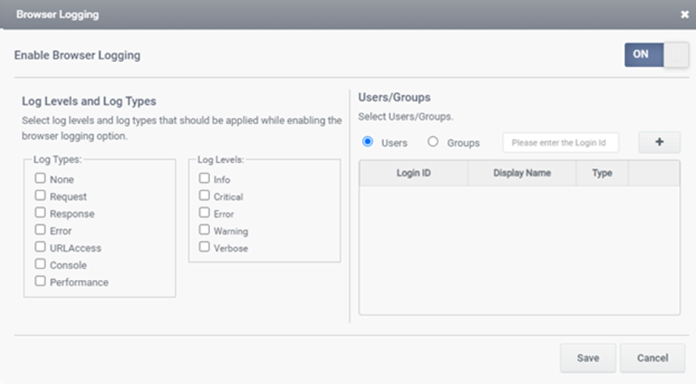
Log Levels and Log Types
Select log levels and log types from the list of log types and log levels that should be applied while enabling browser logging option. Select the user/Group for whom browser logging should be applied.
The log details will be saved in Meta DB/Log DB under the Table [BrowserTabLogs].
Beta Version
Beta features are available in this tab. Here required beta features can be enabled or disabled.
1.Show the Template Builder
This feature is used to enable or disable Template Builder. On enabling this feature Template Builder link appears in the left navigation link as show in the image below

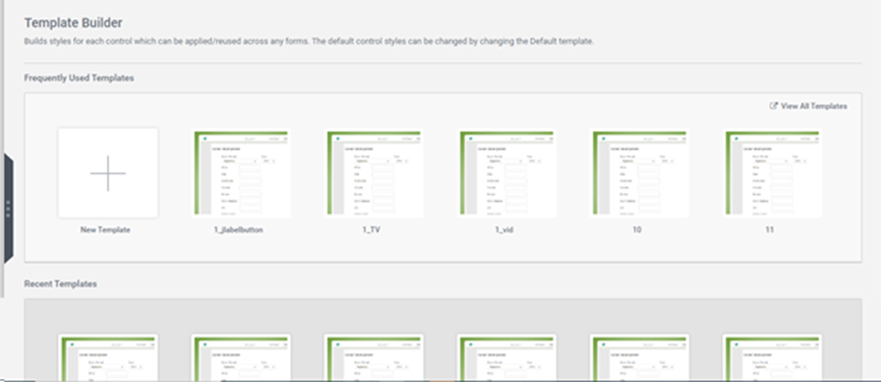
Template Builder
Template Builder is used to build styles for each control which can be applied/reused across any forms. The default control styles can be changed by changing the Default template. The Template Builder page appears as the image shown below
It has two sections
1.Frequently used Templates
Click on New Template. New Template Page appears as shown below

Enter the Template Name in the Template Name field
There are three types of Template available.
1.Blank Template: Template can be created from the Scratch. On clicking Blank Template, Page appears as shown Below
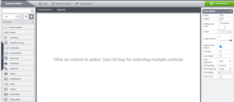
In this window, required template can be created and saved.
Frequently used templates are displayed in this section. In order to view all the template click View all template link as shown in the image below

On click this link, all template will be listed as shown below. Here the templates can be downloaded, edited or deleted.

Recent Templates are displayed in Recent Template section as shown below

2.Show Workflow Admin Panel
This feature is used to enable or disable Workflow Admin Panel. On enabling this feature, Admin Panel Tab will appear on the Workflow Mapping Page as shown in the image below

Query Builder
Query Builder is used to create data form query and get data from dataforms within a tenant. On enabling Query builder, Query Builder link appears on the left navigation link as shown in the image below

On clicking Query Builder, Page appears as shown below

Click on Create query button to create required query for dataform
Enable Form Workflow Import/Export
This feature is used to enable form Workflow during Import and Export.
Calendar
This feature is used to enable and disable calendar control. On enabling Calendar feature, Calendar control will appear on the toolbar as shown in the image below

ProgressBar
This feature is used to enable or Disable ProgressBar. On enabling Progress Bar, Control appears on the toolbar as shown in the image below

Signature
This feature is used to enable or Disable Signature. On enabling Signature, Control appears on the toolbar as shown in the image below

Beta TableView
This feature is used to enable or Disable Beta Tableview. On enabling Beta TableView, Header Style tab appears on the TableView configuration window as shown in the image below

Trace User Access:
This feature is used to trace the users who are all accessing the site. On enabling this feature, a new tab User log appears on the clicking Transaction log on left navigation link as shown in the image below

Here user can be searched based on user name, message, start date and end date.
The list users accessing the site will be displayed in the table.
Search Restful service post method
This feature is used to enable Post method in Restful Datasource for TableView.
Form Version Update
This feature used to enable or disable Form Version Update. On enabling this feature, in debug info of a form, Form build version will be displayed in combobox, where version can be selected and updated as shown in the image below

Slider Control
This feature is used to enable or disable Slider Control. On enabling Slider control, Control appears on the toolbar as shown in the image below

Enable Workflow Dashboard Settings
On enabling this feature WorkFlow Dashboard Settings feature appears on the Basic Settings Tab. This setting will allow you to map a form in the workflow dashboard page for this tenant. Click Manage button. WorkFlow Dashboard PopUp appears as shown below.

Select the custom form for workflow dashboard by clicking the browse button. Select the required form and click save button.
Progress Tracker
This feature is used to enable or disable Progress Tracker. On enabling Progress Tracker, Control appears on the toolbar as shown in the image below

Enable Notification Settings
This settings will allow you to manage Push notification settings for this tenant. On enabling this feature, Notification settings page appears as shown below.

This page contains following options,
1)Maximum Notification Count:
This setting allows user to set the maximum notification count in the latest notification section.
2)Notification Duration (In Days):
This setting allows user to archive notification data to a separate SQL table after the specified duration.
3)Archive Data
Click Archive button to start archiving notification data. Archive notification data is only available if Log DB is configured. Save the notification duration value before archiving data.
4)Notification Item Template:
This setting is to add a Custom HTML Template for every notification item.
5)Enable Remind Me Indicator
This setting allow user to choose Remind Later option on each notification item.
6)Latest Notification Title:
This setting allows the user to add title for the latest notification Section.
7)All Notification Mapping
This setting allows user to map a form to view all the notifications.
8)Notification Item Mapping
This setting allow user to map a form and get the trigger on a control when clicked on a notification item.
After entering the required field Click Save button.
DataForm View
This feature is used to enable or disable DataForm View. On enabling DataForm View, DataForm view link appears on the Left navigation Link as shown in the image below

DataForm view management is used to create views for data forms and for showing view created.
On clicking DataForm View, Data Form View management Page appears as shown below

Select the required DataForm from left side and click Create View button
DataForm View will be created and displayed in the table.
Optimize Auto Height
Optimize Auto Heightis the optimized method to handle the mask of SubForm,Tab Form and External Form Control.
FormAsAPI Logging
This feature is used to log the details in FormAsAPI forms. The logs will be saved in MetaDB under the Table [FormAPITxs].
Enable Encode on DataSource Execution in TextBox
This property is used to encode the value in Textbox on DataSource Execution. On enabling this property, the value in textbox will be encode and saved in DB.
Encode TextBox From Server Side on User Inputs
The update affects the encode-decode feature of the textbox control, enhancing security by performing encoding on the server-side.