ComboBox Material Design
Material design focuses on the structural, aesthetic, and functional behavior of Combobox control. For standard ComboBox controls, the template is determined by the style applied to the ComboBox. Users can modify the ComboBox template by using the Material Design property in the new ComboBox control.
In this new feature, users can set up GroupName, ValueMember, DisplayMember, and n number of Attributes and also able to style the ComtboBox by providing HTML codes.
- GroupName: Users can organize and display data in groups within the ComboBox drop-down list.
- ValueMember: ValueMember represents the corresponding value of a selected item. This data is stored in the data source.
- DisplayMember: The DisplayMember property represents the text information displayed in the drop-down list.
- Attribute: An attribute is additional data intended to be provided in the ComboBox.

Fig 1: ComboBox Material Design UI
MATERIAL DESIGN CONFIGURATION
For applying Template in ComboBox, user need to configure material design property, which is available in the Style property panel.
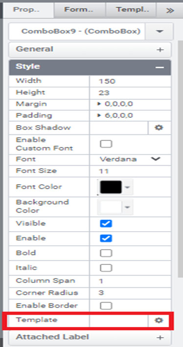
Fig 2: Template Property

Fig 3 : Material Design Configuration Window
This feature provides 2 types of templates, default and Material design.
- Default : Allows the users to set the normal template for the ComboBox.
- Material Design: Allows the users to set the material design template. In this template we are able to apply Pre-Icon, Label, Helper Text, Item Template, Display Template, Animation
- Template Name: It is the name of the given template, it always shows the default name “Material Design”
- Pre-Icon: The users are able to set pre icon through font awesome code.
[ eg: fa fa-download ]
- Label: A word that is attached to the control to identify the field. The users are able to set a label via the Label field since the attached label property and rules are not available for Material design applied ComboBox.
- Helper Text: Helper text gives context about a field’s input, such as how the input will be used. The user is able to set Helper Text via these field.
- Item Template: The users can able to style the drop down of the ComboBox Control using HTML codes.
[ Eg: <h4 data-group=”{{GroupMember}}”>
{{DisplayMember}} – {{ValueMember}} <br>
<h6> {{A1}} </h6> </h4> ]
- Display Template: The users are able to set, which all fields of the value selected from the drop-down list should be displayed in the ComboBox. Values to be displayed should be separated by a comma.
[Eg: GroupMember, DisplayMember, ValueMember ]
- Enable Animation: The users can able to set animation in ComboBox, the animation shows when setting any value to the control.
- Enable Search: Enabling the section provides search facilities for the user.
- Enable Lazy Load: If the user enables the Enable Lazy Load property, only a certain count of data will be loaded initially in the ComboBox, the rest of the data will be loaded only if scrolling down the drop-down list. When this property is enabled, an option to give the maximum item count will appear.

Fig 4: Maximum Item Count Field
DATA SOURCE CONFIGURATION
Material Design applied combobox can be configured as static, MS SQL, stored procedure, and RESTFul service DataSources. Web service DataSource is not available here. In the DataSource configuration window of ComboBox, we can configure GroupName, ValueMember, and DisplayMember. Users can also set the ValueMember and DisplayMember to the same value by using the option Both like normal ComboBox.
In Static DataSource configuration the GroupNames are provided inside the double curly braces.
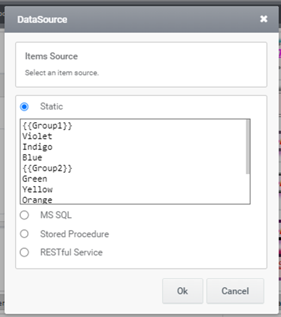
Fig 5: Static Configuration window
MATERIAL PROPERTIES WINDOW
Material Properties options are available in all DataSource configuration windows. In this window, users can configure the Attributes value and able to manage the Group order.
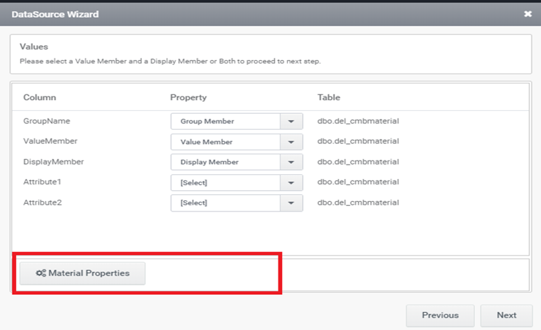
Fig 6: Material Property Button
Attribute Configuration
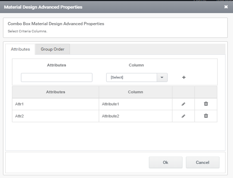
Fig 7: Material Design Advanced Properties Window
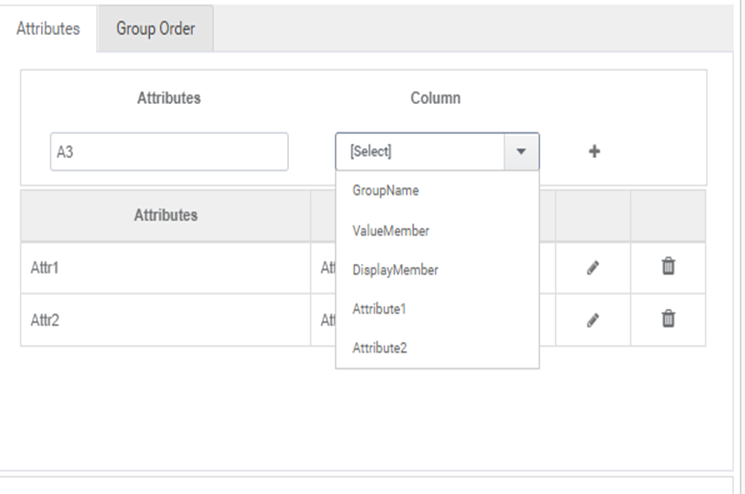
Fig 8: Attribute Configuration
In Attribute Setting user can add any name and configure with a column name. These Attribute names are used in the Display Template, which is present in the Material Design configuration window.
Group Order Management
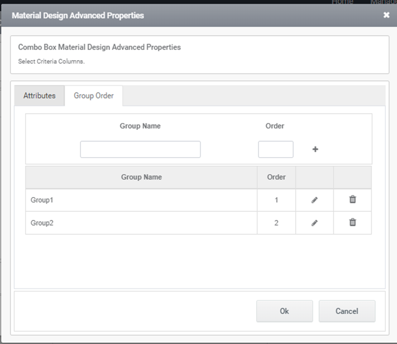
Fig 9: Group Order Management window
Users are able to set the order of the Groups.
The Attribute and Group order are not applicable to Static DataSource.
Conclusion
Material Design is effectively an entire design ecosystem, rather than just a set of style guidelines. Using the ComboBox material design property, it is possible to design a highly organized combobox very quickly and efficiently.