Slider control
The slider control is used to capture a numeric value within a specified range. Its key advantage over text input is that it prevents users from entering invalid values, as every value selectable with the slider is valid.
Working
User can select value on slider control by dragging slider handler within certain range. For range slider, user can select multiple values (start, end). Also results can be displayed on other controls (Textbox, Label) in form. Slider control can be triggered by either sliding the control or by setting value via rule.
Slider Types
Slider Controls can be of 4 types as shown below.
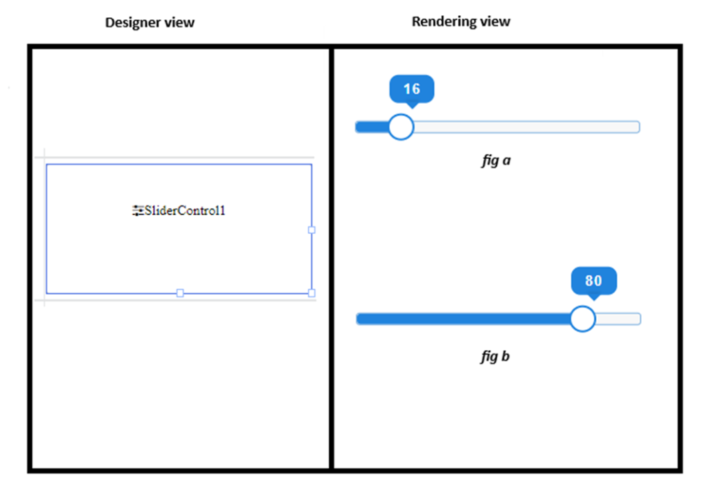
1.Horizontal Slider Control – user can select single output from normal horizontal slider control

2.Horizontal Ranged Slider Control – user can select multiple values (start, end) from ranged slider control

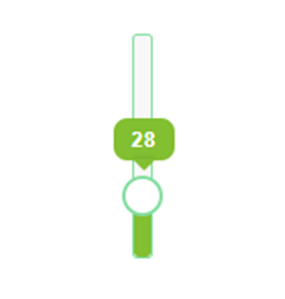
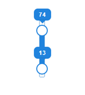
3. Vertical Slider Control – user can select single output from normal vertical slider control
4.Vertical Ranged Slider Control – user can select multiple values (start, end) from vertical ranged slider control
Slider Properties
Here’s the basic list of properties which can be used from rules.
Value – for selecting and setting value from / to normal slider control
StartValue – for get / set Starting value from / to ranged slider control
EndValue – for get / set Ending value from / to ranged slider control
Style.Width – for selecting / setting width from / to slider control
Style.Height – for selecting / setting height from / to slider control
Style.Margin – for selecting / setting margin from / to slider control
Style.BoxShadow – for selecting / setting box shadow from / to slider control
Style.Color – for selecting / setting colour from / to slider control
Style.BackGroundColor – for selecting / setting background colour from / to slider control
Style.Visibility – for selecting / setting visibility from / to slider control
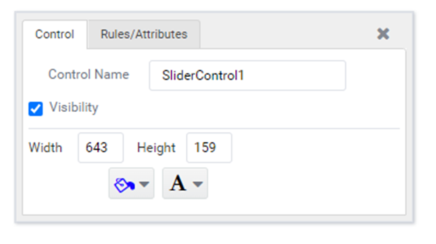
Designer Properties
Here’s the list of available properties (for normal slider control) from designer
Available designer properties for ranged slider control,
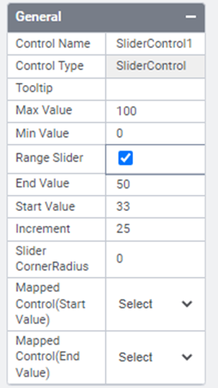


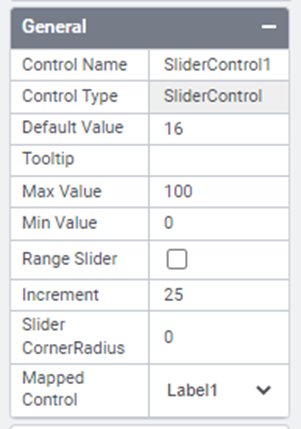
General
Default value – For setting default value for normal slider control.
Tooltip – FOr setting tooltip for both normal, ranged slider control.
Max Value – This option is used to specify the upper value of the range that the slider can attain. The value is represented when the handle is moved to the far right (for horizontal sliders) or top (for vertical sliders). By default, its value is 100.
Min Value – This option is used to specify the lower value of the range that the slider can attain.The value represented when the handle is moved to the far left (for horizontal sliders) or bottom (for vertical sliders). By default, its value is 0.
Ranged Slider – For setting slider control as ranged or normal control.
Increment – This option is used to specify discrete intervals between the minimum and maximum values that the slider is allowed to represent.
Slider CornerRadius – For setting corner radius for slider handler.
Mapped Control – This option is used to display slider results on other controls having type TextBox or Label. This option will automatically display the available controls and won’t trigger the control by displaying result on them.
Start Value – For setting default starting value for ranged slider controls.
End Value – For setting default ending value for ranged slider controls.
Mapped Control (Start Value)- This option is used to display slider Start Value on other controls having type TextBox or Label. This option will automatically display the available controls and won’t trigger the control by displaying result on them.
Mapped Control (End Value)- This option is used to display slider End Value on other controls having type TextBox or Label. This option will automatically display the available controls and won’t trigger the control by displaying result on them.
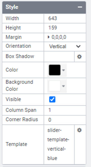
Style
Width – For setting width for both normal slider and ranged slider controls
Height – For setting height for both normal slider and ranged slider controls
Margin – For setting margin for both normal slider and ranged slider controls
Orientation – For setting orientation for both normal slider and ranged slider controls
Box Shadow – For setting box shadow for both normal slider and ranged slider controls
Color – For setting foreground colour for both normal slider and ranged slider controls
Background Color – For setting background colour for both normal slider and ranged slider controls
Visible – For setting visibility for both normal slider and ranged slider controls
Corner Radius – For setting background corner radius for both normal slider and ranged slider controls
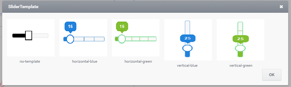
Template – For setting templates with styles for both normal slider and ranged slider controls. User can select one template at a time for applying it to slider control,by default horizontal-blue template will be selected and can be removed by selecting no-template
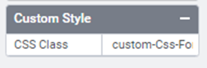
Custom Style
Custom Css – This option is used to display slider results on other controls having type TextBox or Label. This option will automatically display the available controls and won’t trigger the control by displaying result on them.
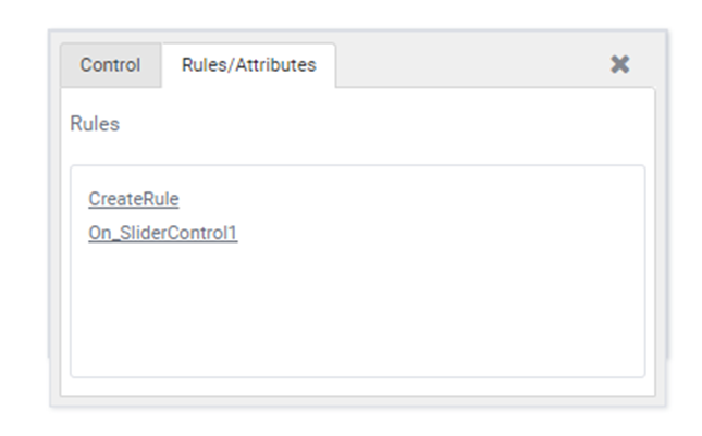
Quick Action Menu
Slider control will contain two Quick action menus (Control, Rules/Attributes)