Signature
Signature Control is employed for digital signing within Appforms. Users have the ability to sign, clear, and update signatures within the signature control feature.
Working with Signature
1: Please create a form with a “Signature Control” feature, as depicted below:
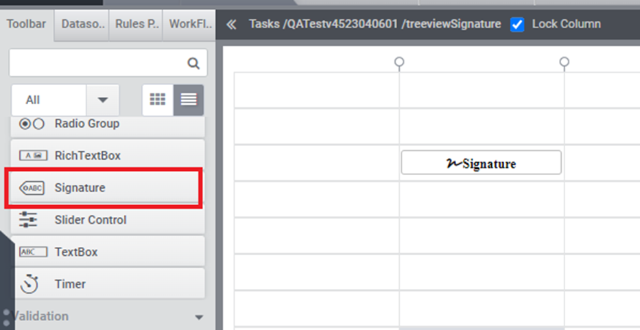
(Figure 1)
2: In the Properties tab, users can adjust parameters such as width, height, border color, and border thickness, among others (refer to Figure 2).
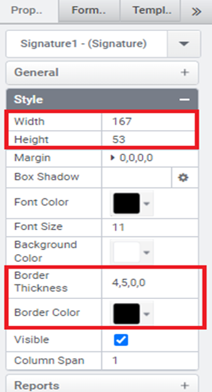
(Figure 2)
3: Below is a preview of a form featuring Signature Control.
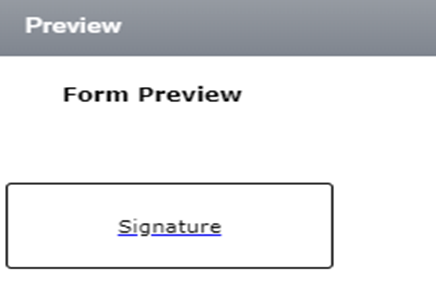
(Figure 3)
4: Users can input their signature by clicking on the control. Upon clicking the “Done” button after entering their signature, it will be displayed within the control (refer to Figure 4 and Figure 5).
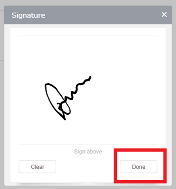
(Figure 4)
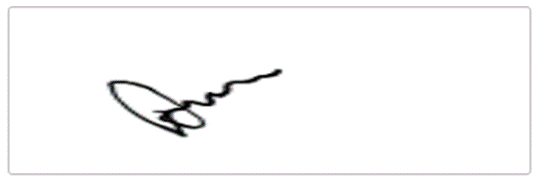
(Figure 5)
5: Clicking the “Clear” button will erase the signature entered by the user (refer to Figure 6).
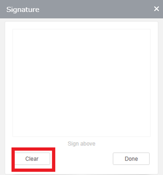
(Figure 6)
Signature Properties
Here is a basic list of properties that can be utilized in rules.
Value –Sets or gets the value from or to the signature control.
Text- Sets the textual content of the signature control.
ToolTip -For sets the text that displayed when a user hovers the mouse pointer over the signature control.
Style.Width – To set the suggested width of the signature control.
Style.Height – To set the suggested height of the signature control.
Style.Margin – To set the outer margin of the signature control.
Style.BoxShadow – To set the box shadow values (horizontal shadow, vertical shadow, blur distance, color) to the signature control.
Style.FontColor – To set the font color of the signature control.
Style.FontSize – To sets the font size of the signature control.
Style.BackGroundColor – To set the background color of the signature control.
Style.BorderColor – To set the border color of the signature control.
Style.Visibility – To show or hide the signature control.
Validation.IsRequired- To enable this property to designate the signature control as mandatory.
Validation.IsRequiredMessage- To displays the message when the validation of the signature control fails.
SpellCheckRequired – To enable or disable the spell check of the signature control.
Designer Properties
Here is the list of available properties in the Signature Control from the designer.
Control Name: Signature
Group: Standard
| S.no | Property name | Data type | Description | |
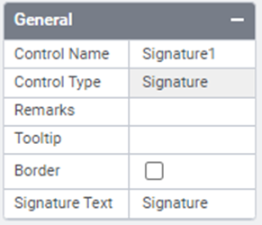
| General | ||||
| 1 | Boarder | String | To show border of the signature control. | |
| 2 | Remarks | String | To make a comment or observation about the signature control for reference. | |
| 3 | ToolTip | String | The texts that to be displayed when the user hover the mouse pointer over the control, without clicking it. | |
| 4 | Signature Text | String | Set signature text | |
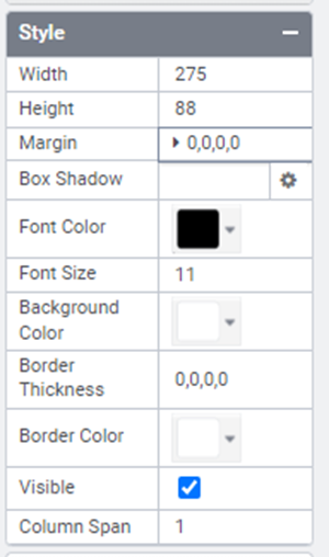
| Style | ||||
| 5 | Width | String | Sets the suggested width or thickness of the control. | |
| 6 | Height | String | Sets the suggested height of the control. | |
| 7 | Box Shadow | String | Show box shadow values(Horizontal shadow, vertical shadow, blur shadow , color) | |
| 8 | Margin | String | Sets the edge or outer margin to the control. | |
| 9 | Font Size | String | Sets the font size. | |
| 10 | Font Color | String | Sets the text font color of the control. | |
| 11 | Background Color | String | Sets the Background color of the control. | |
| 12 | Border Thickness | Integer | Sets Thickness of the border of the control. | |
| 13 | Visible | String | To manage the visibility of the control. | |
| 14 | Column Span | Integer | To merge the number of columns specified. | |
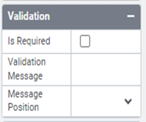
| Validation | ||||
| 15 | Is Required | Boolean | Helps to check whether user has to give input in the control or not. If this property is enabled, this will not allow the user to save a form without giving the input. | |
| 16 | Validation Message | String | Display the message when validation fails | |
| 17 | Message Position | String | Sets the position of the validation message. | |
| Template | ||||
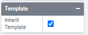
| 18 | Inherit Template | Boolean | Enable this property to inherit control style from applied template. | |
| Custom Style | ||||
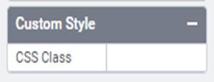
| 19 | CSS Class | String | This feature enables you to incorporate a CSS class into your control, thereby altering the default formatting for any of our themes. | |
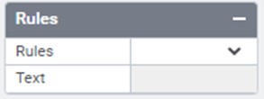
| Rules | ||||
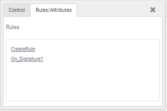
| 20 | Rules | Upon selecting the control, clicking the Rules tab expands it to display a Rules property. Users can choose “Create Rule” from a drop-down list. Clicking the “Create Rule” link button will then navigate the user to the Rules Engine. The same control will be added as a trigger by default to execute the Rule. | ||
| 21 | Text | String | Sets the signature control’s text. | |
| Reports | ||||
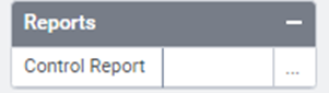
| 22 | Control Report | Control Report will redirect to Reports tab that will display all the configurations, rules and data sources details associated to the selected control. | ||
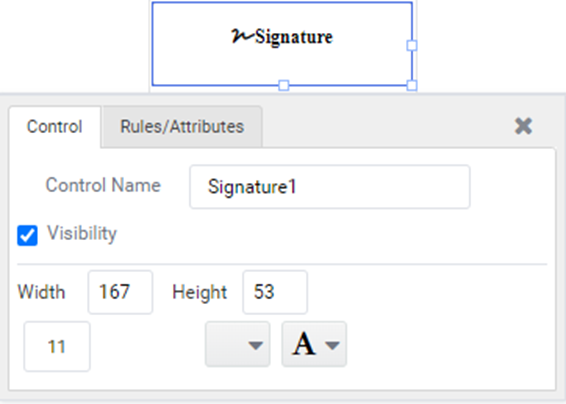
Quick Action Menu
The Signature control will include two quick action menus: one for Control and another for Rules/Attributes.