Content Editor
The Content Editor in Appforms allows custom CSS, JavaScript, and HTML to be integrated for form-specific requirements beyond default options.
Working with Content Editor
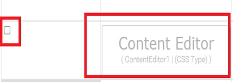
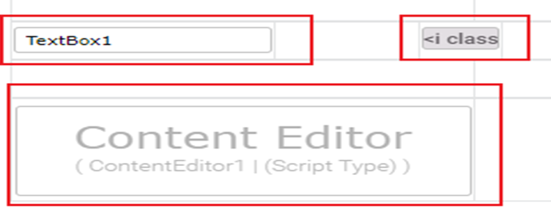
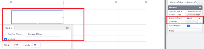
Create a form, drag and drop a Content Editor as shown below.
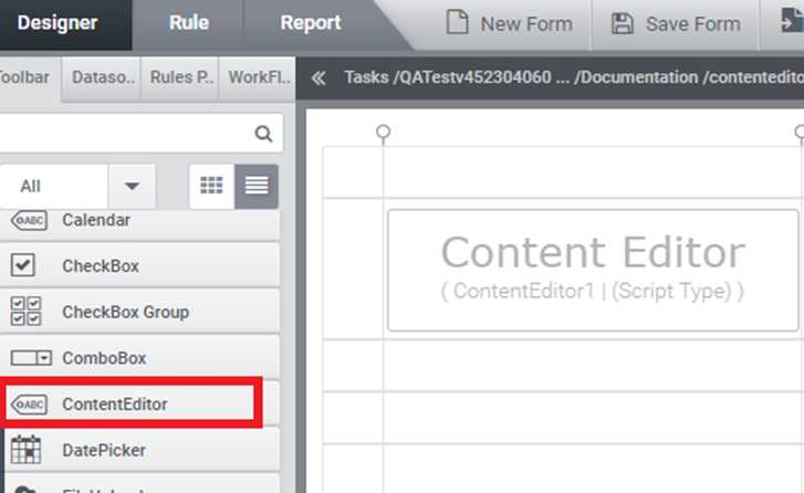
(Figure 1)
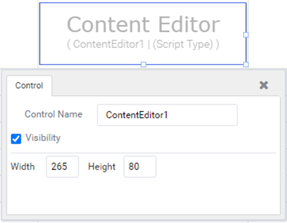
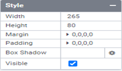
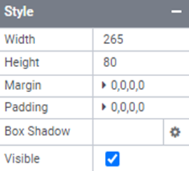
- Select the control and in the properties tab, the User can set width, height, margin, padding, etc.
(Figure 2)
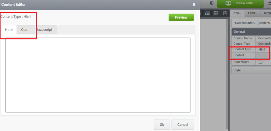
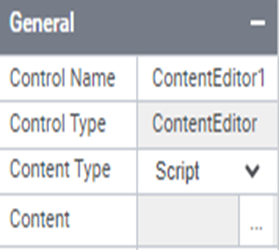
Types of Content Editor
- CSS
- SCRIPT
- HTML
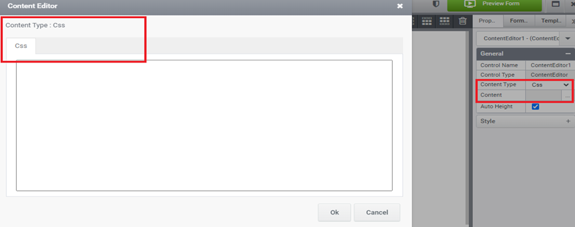
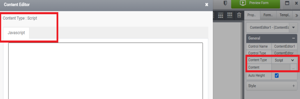
Users can select Content Types from general properties based on their requirements.
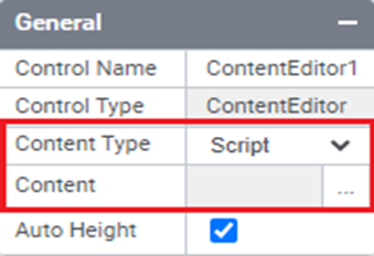
(Figure 3)
1. Content Type – CSS
- We can design the look and feel of forms using Cascading Style Sheets (CSS). This allows us to customize the appearance of the form controls and the overall form itself. Simply choose “CSS” as the content type and then tailor the custom CSS code to match your specific needs.
(Figure4)
Example: – If the user has the requirement to set CheckBox control to toggle switch. Drag and drop checkbox control and Content Editor to a form.
(Figure 5)
- Users can apply CSS by selecting content type as CSS and configuring the code to set the toggle switch. (Figure 6,7,8)
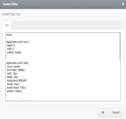
(Figure 6)
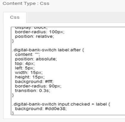
(Figure 7)
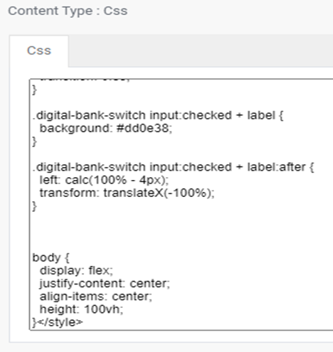
(Figure 8)
- A preview of a form having CSS applied to control is shown below.
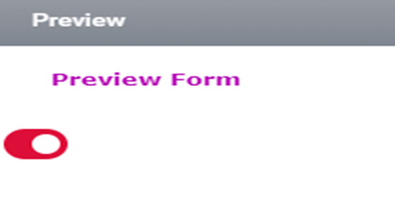
(Figure 9)
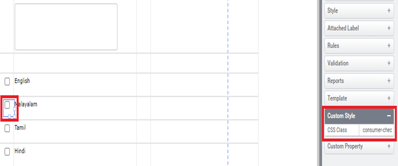
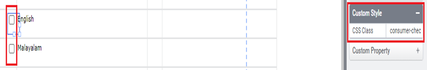
- Users can apply CSS to particular controls using the ‘Custom Style’ property, without affecting other controls on the same form. This can be done by configuring a CSS Class name.
(Figure 10)
Example: -If the user has a requirement to set the Grey checkbox for English & Malayalam and the default checkbox for Tamil & Hindi. User can call the Class from CSS content type to Custom style property of that particular control that needs to be a Grey checkbox. CSS of the Grey check box is shown below (Figures 11, 12, 13).
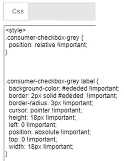
(Figure 11)
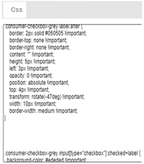
(Figure 12)

(Figure 13)
- CSS class called to custom style property of controls which needs a Grey checkbox as shown below.
(Figure 14)
- Controls with default checkbox are shown below.

(Figure 15)
- A preview of a form is shown below, displaying controls both with and without applied CSS.
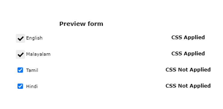
(Figure 16)
2. Content Type – Script
- Custom JavaScript is utilized in Appforms to extend the functionalities of form controls and forms beyond their default capabilities. Users have the option to choose ‘Script’ from the Content Type and tailor custom JavaScript according to their specific requirements.
(Figure 17)
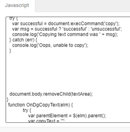
Example: – If the user has the requirement to set copy to clipboard of the text entered in TextBox using button control. Drag & drop ‘TextBox’ control, ‘Button’ control, and ‘Content Editor’ to a form.
(Figure 18)
- User can easily configure custom JavaScript by selecting content type as Script and entering code for copy to clipboard. (figures 19,20,21)
(Figure 20)
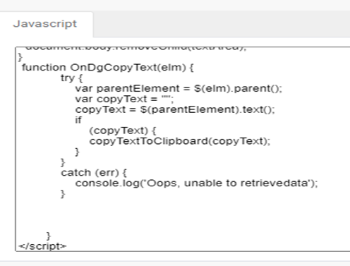
(Figure 21)
- The function ‘InvokeJavaScript()’ in AppForms can be triggered using the button control as in the below figure. This allows users to invoke JavaScript functions.
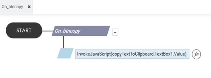
(Figure 22)
- A preview of a form having Java Script applied to control is shown below.
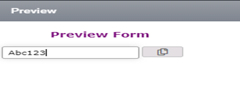
(Figure 23)
3. Content Type – HTML
- HTML (Hyper Text Markup Language) is the standard language used to create web pages. It uses tags and attributes to structure content such as headings, paragraphs, images, and links. Web browsers interpret HTML to display web pages to users. While HTML defines the content and structure of a web page, other technologies like CSS manage the appearance and JavaScript manage the functionality of the page.
- The user can select ‘HTML’ from the Content Type and configure custom HTML based on requirements, along with custom CSS and JavaScript.
(Figure 24)
Example: – If a user has requirements to display a website in Appforms. Drag and drop ‘Content editor’ to a form. Set HTML by selecting the Content Type as HTML (Figure 25) and enter HTML code (Figure 26).
(Figure 25)
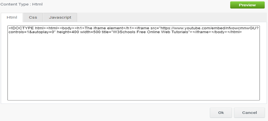
(Figure 26)
- A preview of a form having HTML applied is shown below.

(Figure 27)
Content Editor Properties
Here’s the basic list of properties that can be used from rules.
Style.Width – for selecting and setting width from/to content editor control
Style.Height – for selecting and setting height from/to content editor control
Style.Margin – for selecting and setting margin from/to content editor control
Style.BoxShadow – for selecting and setting box shadow from/to content editor control
Style.Visibility – for selecting and setting visibility from/to content editor control
CSS – for selecting and setting CSS from/to content editor control
HTML – for selecting and setting HTML from/to content editor control
JS – for selecting and setting Java script from/to content editor control
Designer Properties
Here’s the list of available properties in Content Editor from Designer.
Control Name: Content Editor
Group: Standard
| S.no | Property name | Data type | Description |
| General | |||
| 1 | Content Type | String | Set the content type of the control. |
| 2 | Content | String | Set the contents of the controls. |
| 3 | Auto Height | Integer | Enable/Disable auto height. |
| Style | |||
| 5 | Width | String | Sets the suggested width or thickness of the control. |
| 6 | Height | String | Sets the suggested height of the control. |
| 7 | Margin | String | Sets the edge or outer margin to the control. |
| 8 | Padding | String | Sets the padding of the control( left, top, right, bottom) |
| 9 | Box Shadow | String | Show box shadow values(Horizontal shadow, vertical shadow, blur shadow , color) |
| 10 | Visible | Boolean | Sets the visibility of the control while rendering. |
Quick Action Menu
Content Editor Control will contain one Quick action menu (Control).