Line Chart
A line chart is a graphical representation of data that displays information as a series of data points connected by straight line segments. It is commonly used to show the relationship between two variables and how they change over a continuous period.
· Basic Line Charts
A basic line chart is a simple form of the line chart that represents a series of data points connected by straight lines. It is typically used to display trends or changes in data over time or across different categories.
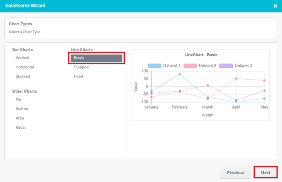
Figure 26
- Provide the basic details for Chart control and click the ‘Next’ button.
- Chart Title: It appears at the top of the chart and helps the viewer understand the purpose or context of the chart at a glance.
- Label-X (Horizontal) Axis: The horizontal axis represents the independent variable or the categories being measured. It provides a description of what is being measured in the Horizontal Axis
- Label-Y (Vertical) Axis: The vertical axis that represents the numerical values or measurements being plotted or compared. It provides a description of what is being measured in Vertical Axis
- Type of Line: There are two types of lines available. Line and dashed Type.
- Hide Axis lines: Hiding axis lines refers to the act of removing or hiding the lines that represent the axes in a chart.
- Add Custom Method: Add Custom Method is for developers. When you select Add Custom Method, you will be prompted to enter a method name.
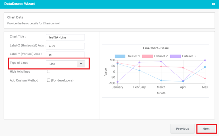
Figure 27
- In Preview, Chart control gets populated with given data. Here we select Type of Line as Line.
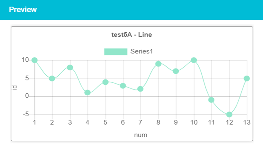
Figure 28
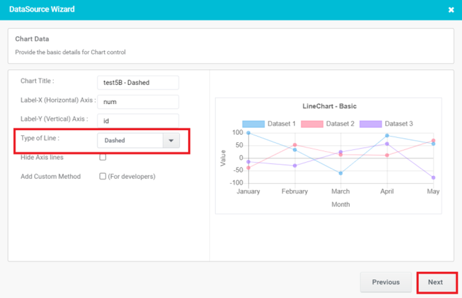
Figure 29
- In Preview, Chart control gets populated with given data. Here we select Type of Line as Dashed.
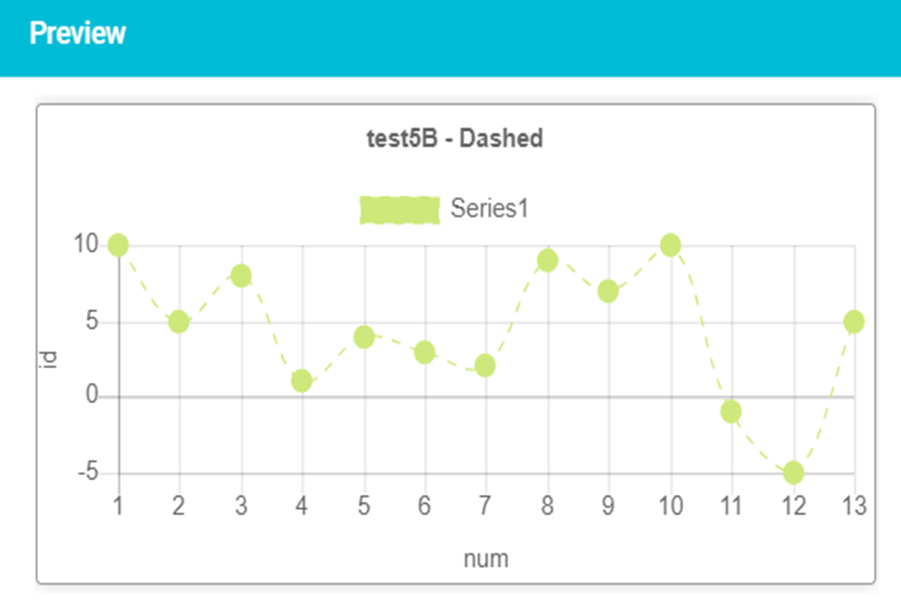
Figure 30
- Stepped Line Charts
A stepped line chart is a line chart in which points are connected by horizontal and vertical line segments, looking like steps of a staircase.
- Select a Chart Type as Stepped and click the ‘Next’ button.
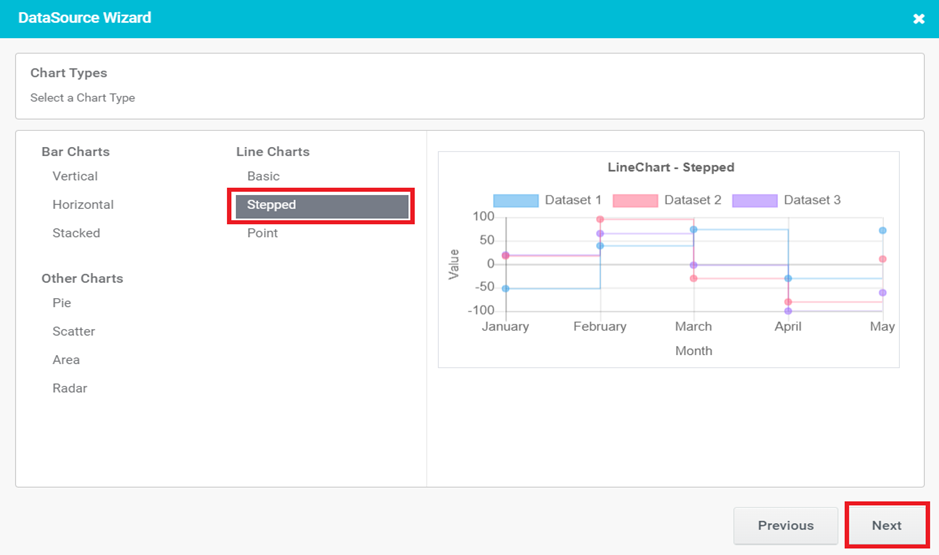
Figure 31
- Provide the basic details for Chart control and click the ‘Next’ button.
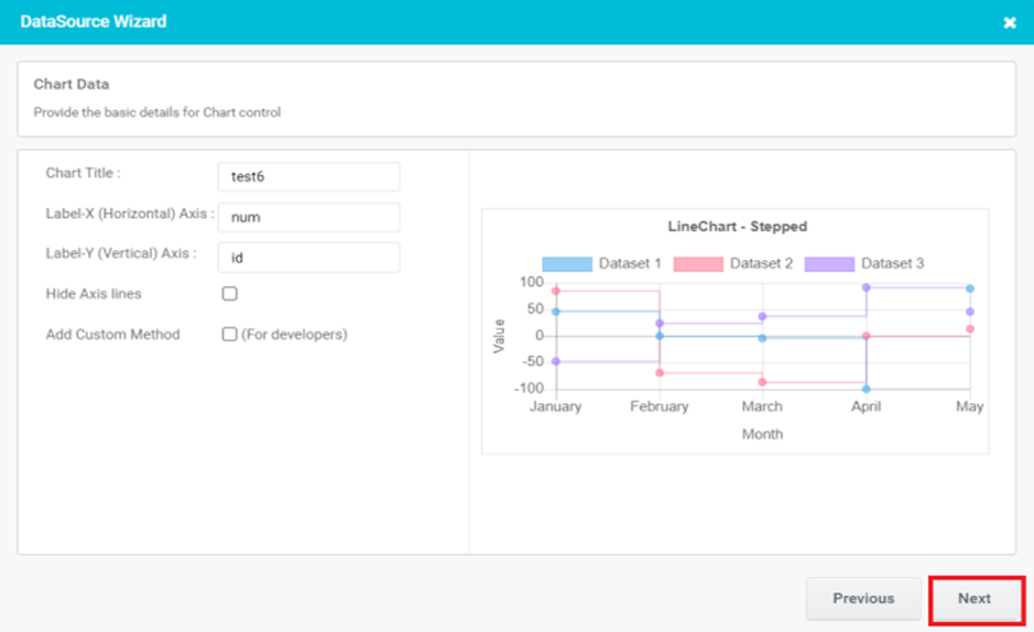
Figure 32
- Configure the Chart options and click the ‘Next’ button.

Figure 33
- In Preview, Line Charts- Stepped gets populated with given data.
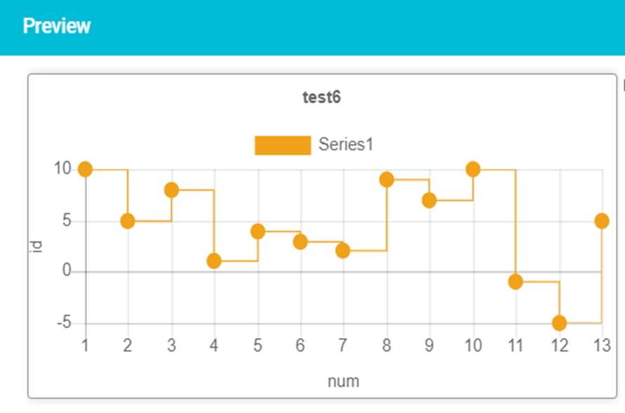
Figure 34
- Point Line Charts
A point-line chart, is a type of data visualization that displays the relationship between two numerical variables. It consists of individual data points represented by dots or markers, to show the trend or pattern in the data. - Select a Chart Type as Point and click the ‘Next’ button.
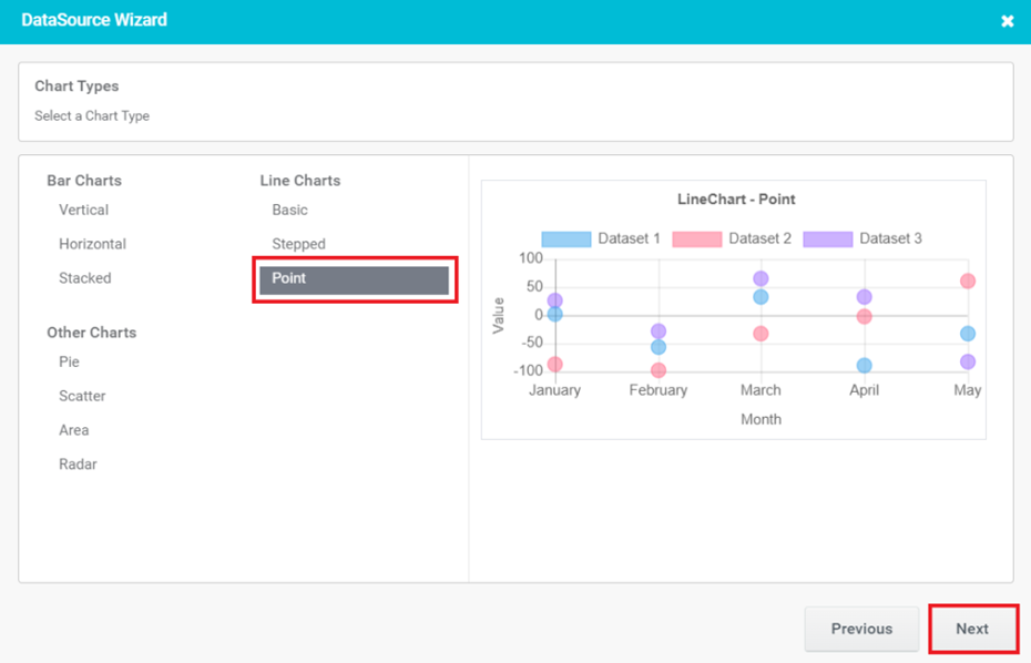
Figure 35
- Provide the basic details for Chart control and click the ‘Next’ button.
- Chart Title: It appears at the top of the chart and helps the viewer understand the purpose or context of the chart at a glance.
- Label-X (Horizontal) Axis: The horizontal axis represents the independent variable or the categories being measured. It provides a description of what is being measured in the Horizontal Axis.
- Label-Y (Vertical) Axis: The vertical axis that represents the numerical values or measurements being plotted or compared. It provides a description of what is being measured in the Vertical Axis.
- Point Style: The available point styles are Circle, Triangle, Rectangle, Rhombus, Plus, Cross, Star, and more. Based on the selected point style data will be populated in the preview.
- Hide Axis lines: Hiding axis lines refers to the act of removing or hiding the lines that represent the axes in a chart.
- Add Custom Method: Add Custom Method is for developers. When you select Add Custom Method, you will be prompted to enter a method name.
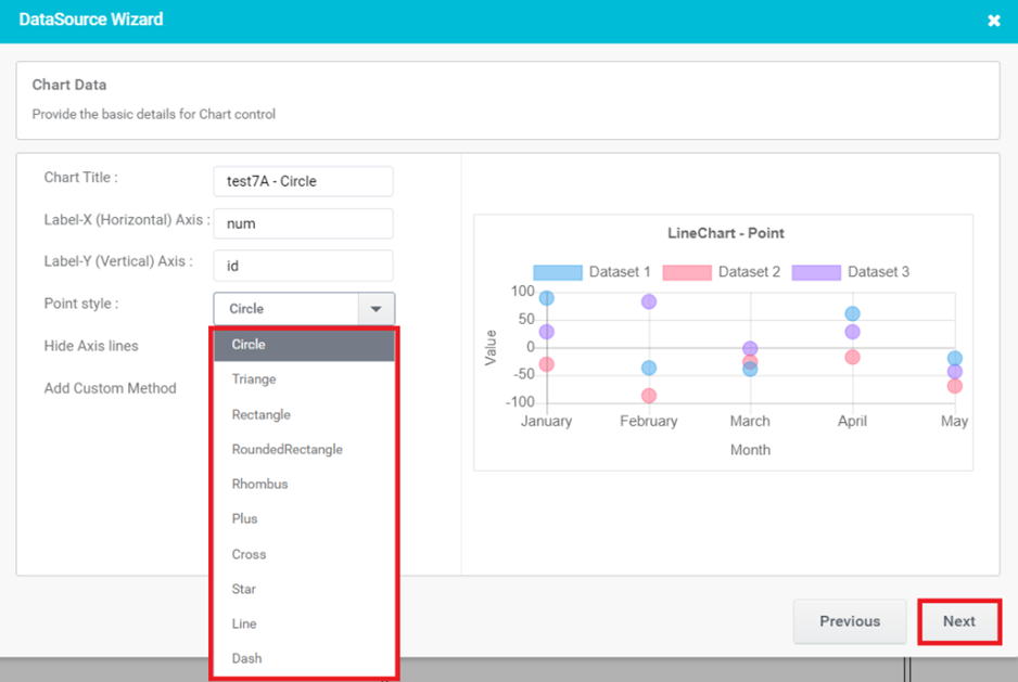
Figure 36
- Configure the Chart options and click the ‘Next’ button.
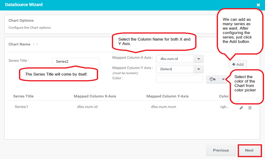
Figure 37
- In Preview, Line Charts- Point gets populated with a given Point Style.
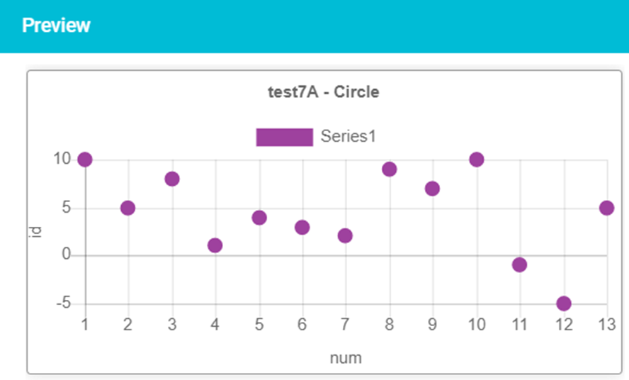
Figure 38