Chart Control
A chart is a visual representation of data or information, typically presented in the form of graphs, diagrams, or tables. Charts are used to communicate complex data in a concise and easy-to-understand format. They provide a visual representation that allows for quick analysis, comparison, and identification of patterns or trends within the data. The uses of charts are diverse and applicable across various fields.
Chart Types
Charts can be classified into various types based on their purpose and the nature of the data being represented. Here are some common classifications of charts:
1.Bar Charts
- Vertical
- Horizontal
- Stacked
2.Line Charts
- Basic
- Stepped
- Point
3.Other Charts
- Pie
- Scatter
- Area
- Radar
Chart Properties
Here’s the basic list of properties that can be used from rules.
ToolTip – The text that needs to be displayed when a user pauses the mouse pointer over the control.
Style.Width – Sets the suggested width of the control.
Style.Height – Sets the suggested height of the control.
Style.BoxShadow – Box Shadow values (horizontal shadow, vertical shadow, blur distance, color).
Style.Visibility – To Show/Hide the control.
XValue – Get x-axis value of the chart on clicking the chart.
YValue – Get y-axis value of the chart on clicking the chart.
Designer Properties
Here’s the list of available properties (for Chart) from designer
| S.no | Property name | Data type | Description |
| General | |||
| 1 | Tooltip | String | The text that needs to be displayed when the user hovers the mouse pointer over the control, without clicking it. |
| 2 | Remarks | String | To make a comment or observation about the control for reference. |
| Style | |||
| 3 | Width | String | Sets the suggested width or thickness of the control. |
| 4 | Height | String | Sets the suggested height of the control. |
| 5 | Box Shadow | String | Set the box shadow of the control by giving horizontal and vertical shadow values, the needed blur distance, and the appropriate color. |
| 6 | Background Color | String | Sets a brush that describes the Background color of the control. |
| 7 | Visible | Boolean | Sets the visibility of the control while rendering. |
| 8 | Column Span | String | To merge the number of columns specified. |
| Data Source | |||
| 9 | Items | On clicking the gear button of the items a datasource window will be displayed. | |
| Reports | |||
| 10 | Control Report | Control Report will redirect to the Reports tab that will display all the configurations, rules, and datasources details associated with the selected control. | |
| Rules | |||
| 11 | Rules | After selecting the control, If the user clicks the Rules tab it will be expanded and display a Rules property. Create Rule can be selected from a drop-down list. On clicking the Create Rule link button will navigate the user to the Rules Engine. The same control will be added as a trigger by default to execute the Rule. | |
| Template | |||
| 12 | Inherit Template | Boolean | Enable this property to inherit the control style from the applied template |
| Custom Style | |||
| 13 | CSS Style | String | Allows you to add CSS class to your control to change the default formatting for any of our themes |
Quick Action Menu
Chart will contain three Quick action menus (Control, DataSource, and Rules/Attributes)
- Control tab can be used to Configure the Control Name, Visibility, Width, Height and BG Color properties of the Control.
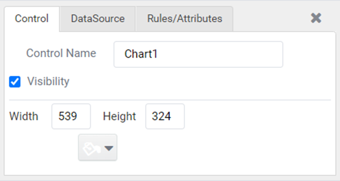
Figure 1
- DataSource tab can be used to Configure the DataSource Configuration of the Control.
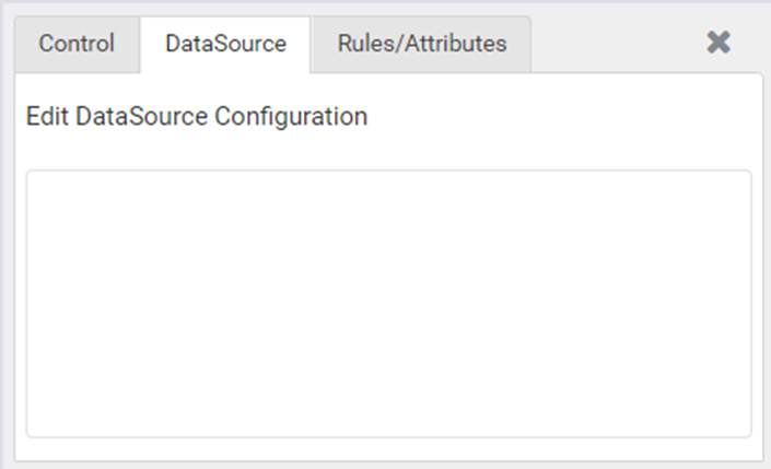
Figure 2
- Rules tab can be used to Create or Configure the rules associated with the Control.

Figure 3