Bar Chart
A bar chart is a graphical representation of data using rectangular bars. It is a common way to display categorical or discrete data, where each category or group is represented by a separate bar. The length or height of each bar corresponds to the quantity or value being represented.
· Vertical Bar Charts
A vertical bar chart, is a type of bar chart where the bars are drawn vertically along the vertical axis.
- Create a form having a ‘Chart’, as shown below:-
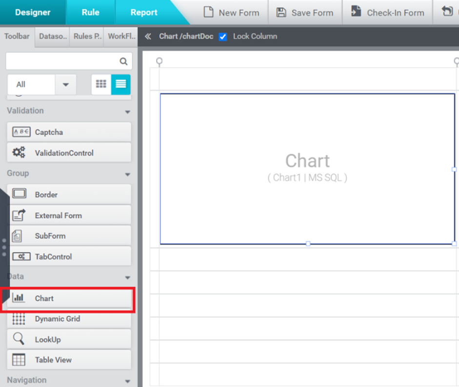
Figure 1
- Configure the data source for Chart control with MS SQL from the ‘Properties’ window available on the right-hand side of the form.
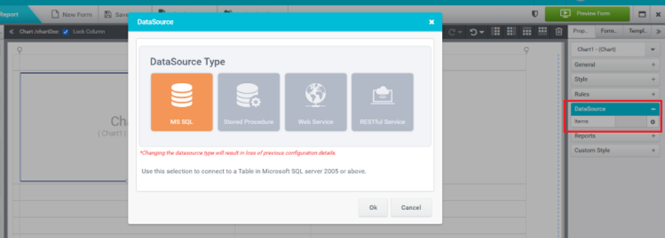
Figure 2
- A ‘Data source Wizard’ will pop up. Select the data source from the window and click the ‘Next’ button.
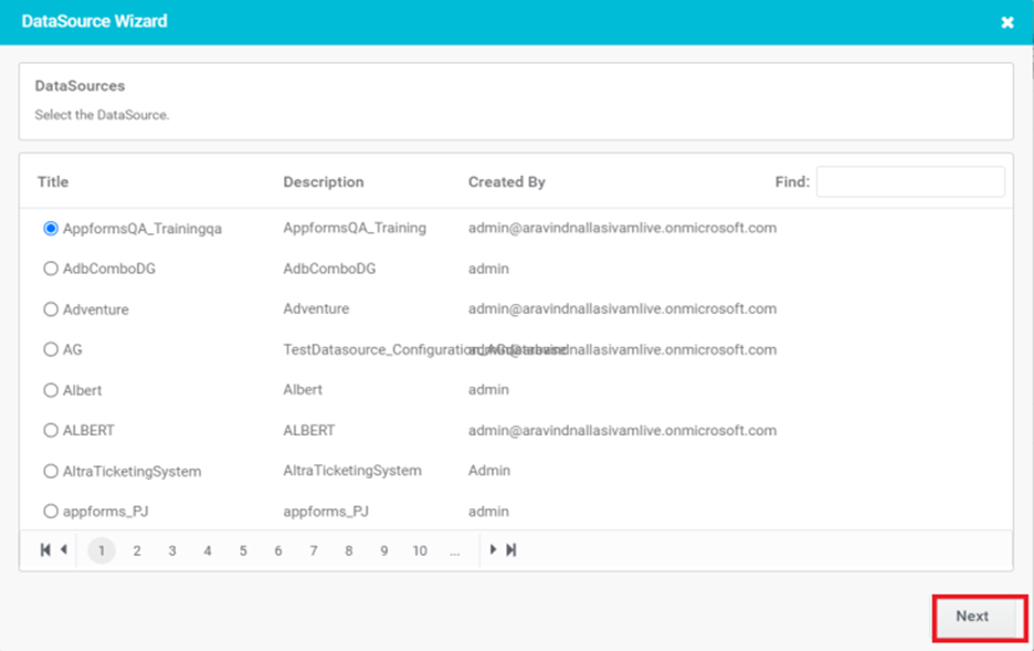
Figure 3
- Select the table name from the window and click the ‘Next’ button.
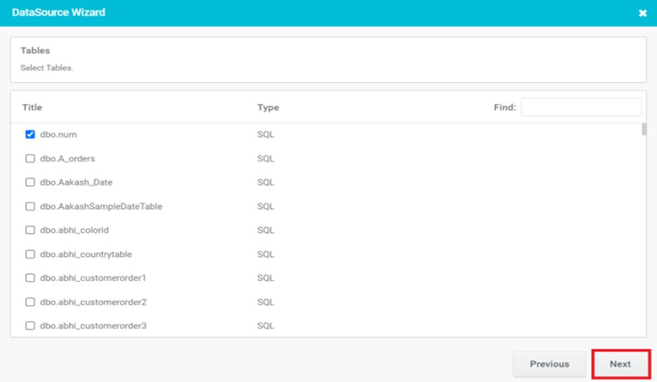
Figure 4
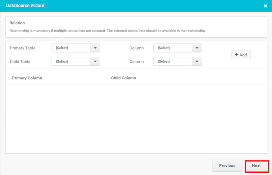
Figure 5
- Set the criteria based on which the Chart is to be populated and click the ‘Next’ button.
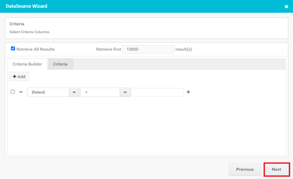
Figure 6
- Select a Chart Type as Vertical and click the ‘Next’ button.
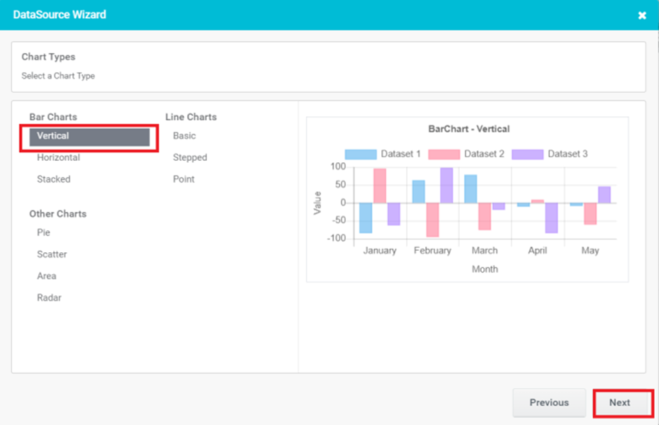
Figure 7
- Provide the basic details for Chart control and click the ‘Next’ button.
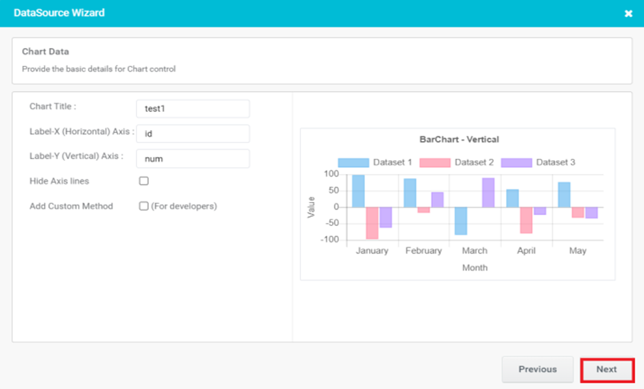
Figure 8
- Chart Title: It appears at the top of the chart and helps the viewer understand the purpose or context of the chart at a glance. The chart title is often used to highlight the main message or key insights conveyed by the chart.
- Label-X (Horizontal) Axis: The horizontal axis represents the categories or groups being compared or analyzed in the chart. The x-axis is positioned horizontally at the bottom of the chart and runs from left to right. It is used to label and distinguish the different data points or series in the chart.
- Label-Y (Vertical) Axis: The vertical axis that represents the numerical values or measurements being plotted or compared. The y-axis is positioned vertically on the left or right side of the chart and runs from bottom to top.
- Hide Axis lines: Hiding axis lines refers to the act of removing or hiding the lines that represent the axes in a chart.
- · Add Custom Method: Add Custom Method is for developers. When you select Add Custom Method, you will be prompted to enter a method name. This method (javascript function) is invoked and the chart data is passed as a parameter when the chart FillData rule is executed.
- Configure the Chart options and click the ‘Next’ button.

Figure 9

Figure 10
- Select a trigger and click on Finish button.

Figure 11
- In Preview, Chart control gets populated with given data.
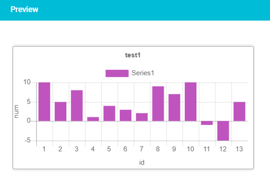
Figure 12
· Horizontal Bar Charts
A horizontal bar chart, is a graphical representation of data using rectangular bars. In a horizontal bar chart, the bars are plotted horizontally, with the lengths of the bars corresponding to the values they represent. The horizontal axis typically represents the categories or groups being compared, while the vertical axis represents the numerical values being measured.
- Create a form having a ‘Chart’.
- Configure the data source for Chart control with MS SQL from the ‘Properties’ window available on the right-hand side of the form.
- A ‘Data source Wizard’ will pop up. Select the data source from the window and click the ‘Next’ button.
- Select the table name from the window and click the ‘Next’ button.
- Relationship is mandatory if multiple tables/lists are selected. click the ‘Next’ button.
- Set the criteria based on which the Chart is to be populated and click the ‘Next’ button.
- Select a Chart Type as Horizontal and click the ‘Next’ button.
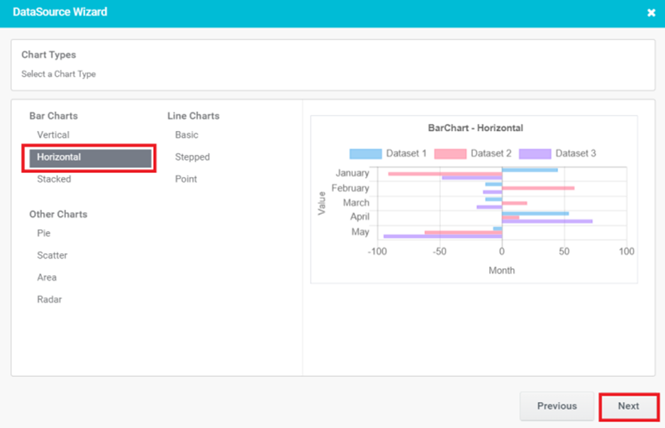
Figure 13
- Configure the Chart options and click the ‘Next’ button.
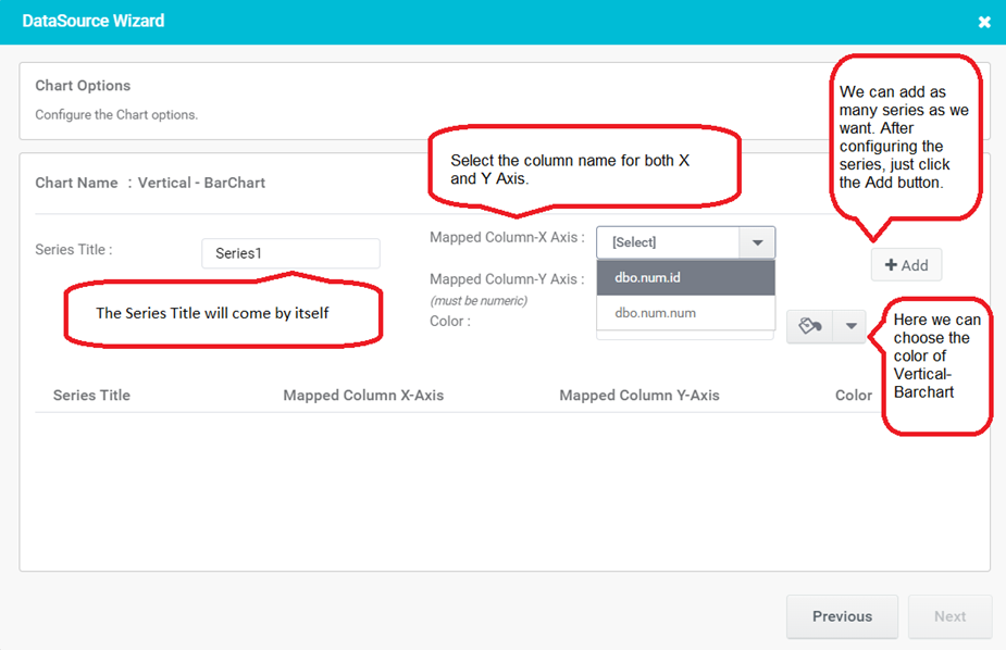
Figure 14
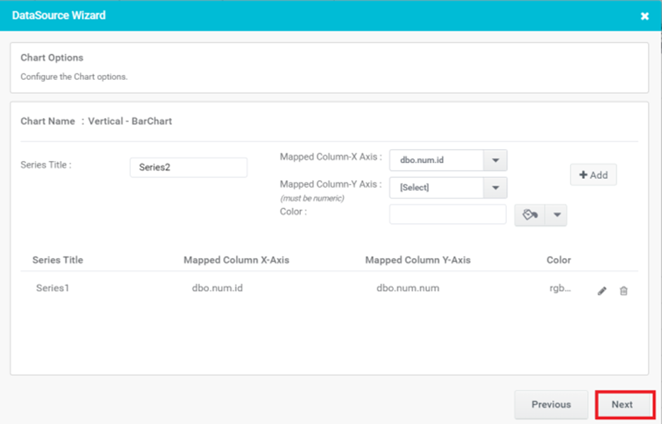
Figure 15
- Select a trigger and click on the Finish button.
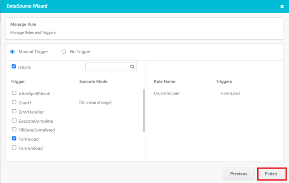
Figure 16
- In Preview, Chart control gets populated with given data.
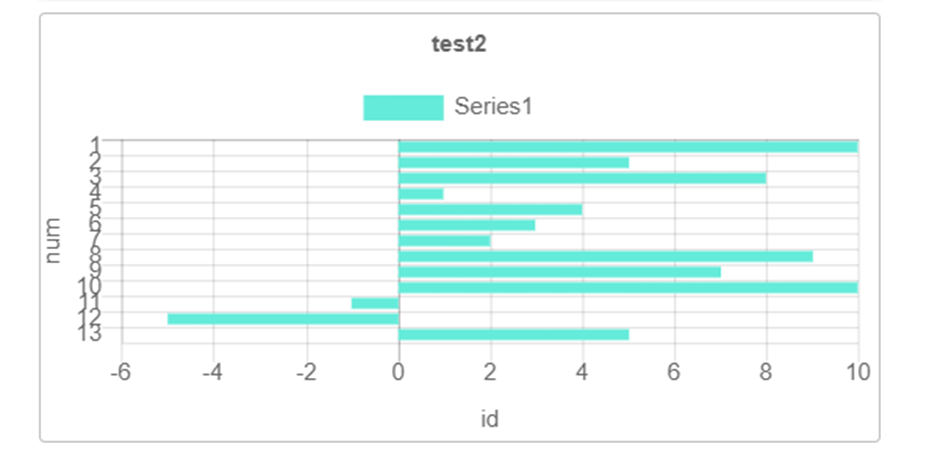
Figure 17
· Stacked Bar Charts
A stacked bar chart is a graphical representation of data that uses rectangular bars to display multiple variables or categories within a single bar. In a stacked bar chart, each bar represents a total value, and it is divided into segments or sections that correspond to different subcategories or components of the total value.
- Select the table name from the window and click the ‘Next’ button.
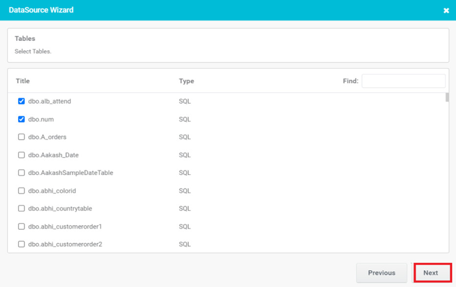
Figure 18
- Relationship is mandatory if multiple tables/lists are selected. click the ‘Next’ button.
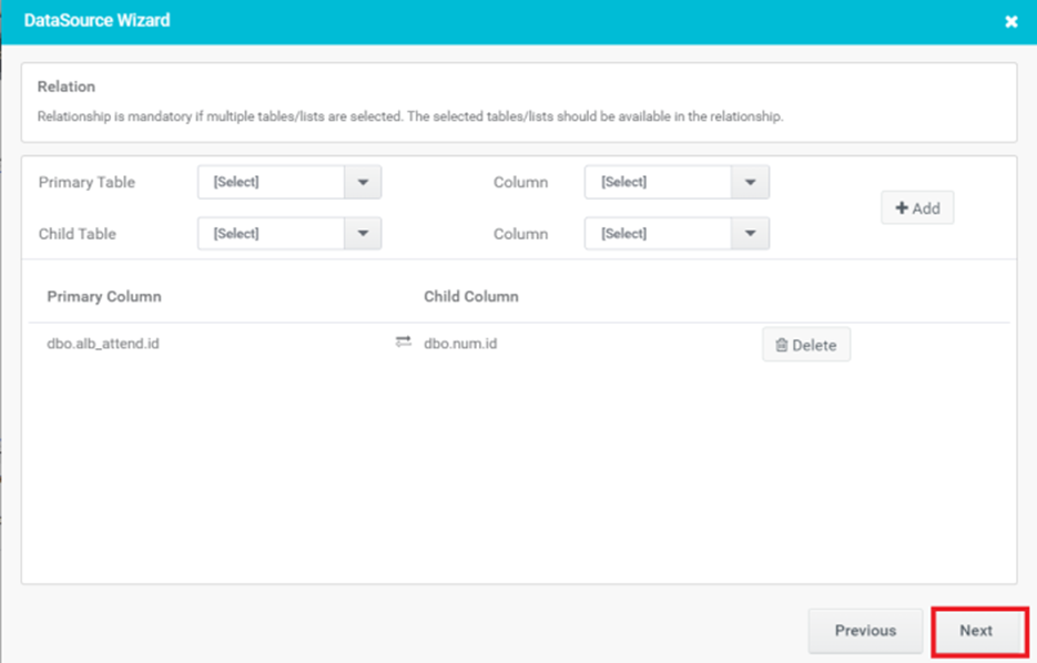
Figure 19
- Set the criteria based on which the Chart is to be populated and click the ‘Next’ button.

Figure 20
- Select the Chart type as Stacked and click the ‘Next’ button.
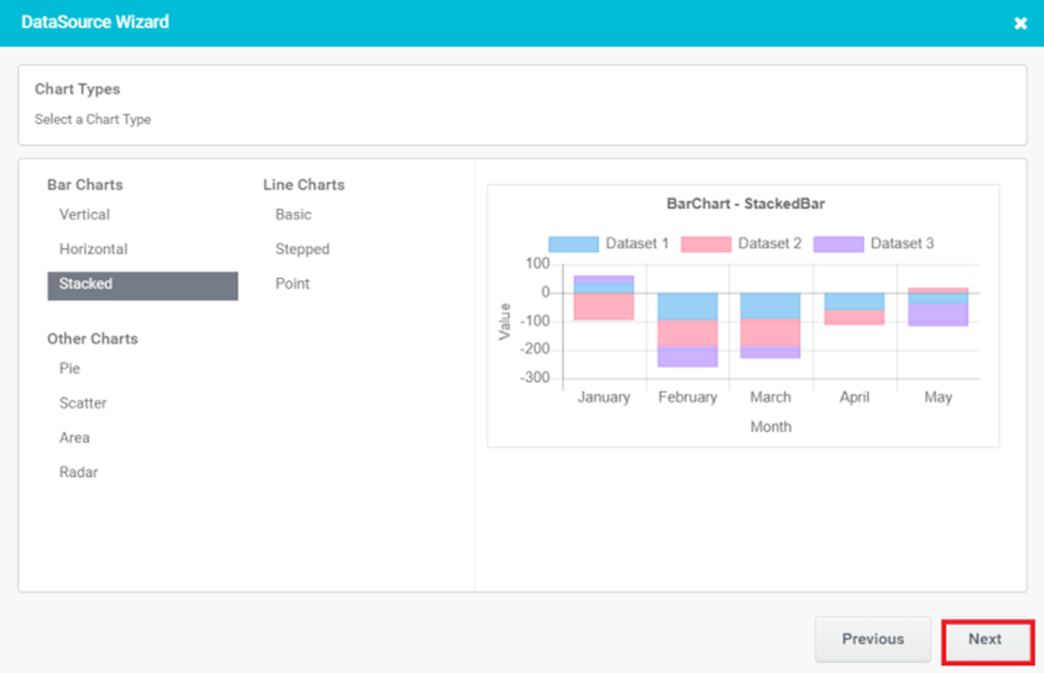
Figure 21
- Provide the basic details for Chart control and click the ‘Next’ button.
- Chart Title: It appears at the top of the chart and helps the viewer understand the purpose or context of the chart at a glance.
- Label-X (Horizontal) Axis: The horizontal axis represents the categories or groups being compared or analyzed in the chart.
- Label-Y (Vertical) Axis: The vertical axis that represents the numerical values or measurements being plotted or compared.
- Hide Axis lines: Hiding axis lines refers to the act of removing or hiding the lines that represent the axes in a chart.
- Add Custom Method: Add Custom Method is for developers. When you select Add Custom Method, you will be prompted to enter a method name.
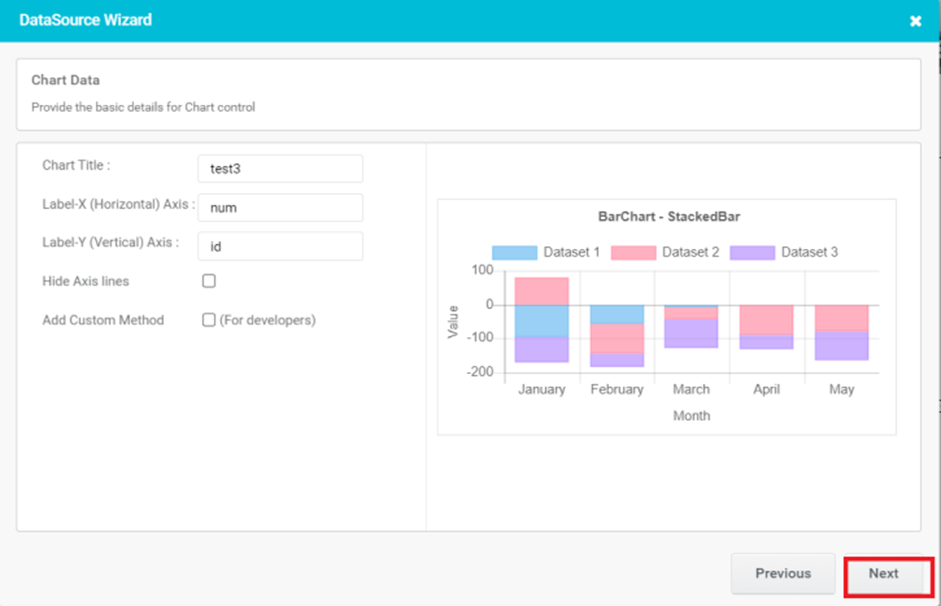
Figure 22
- Configure the Chart options and click the ‘Next’ button.
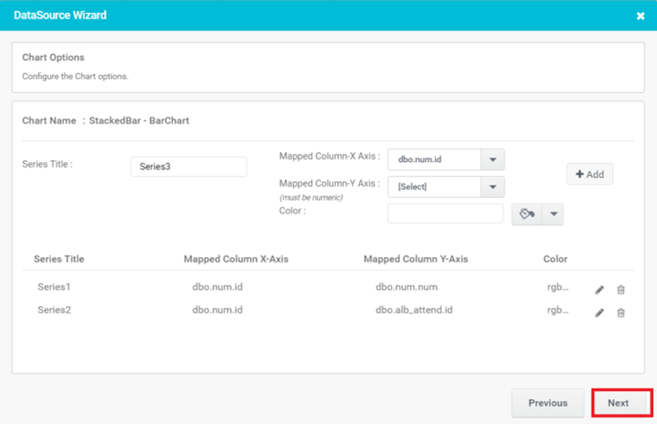
Figure 23
- Select a trigger and click on the Finish button.
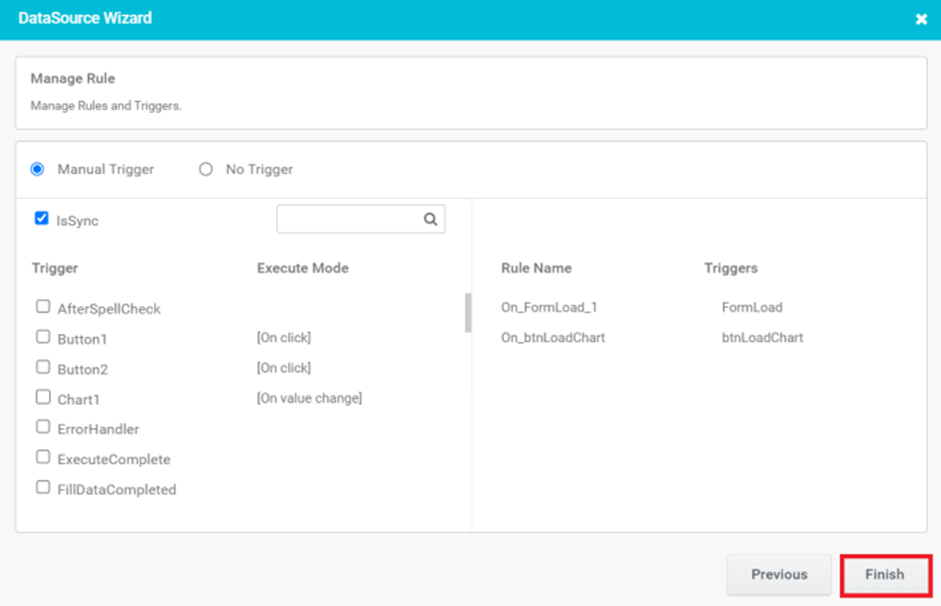
Figure 24
- In Preview, Chart control gets populated with given data.
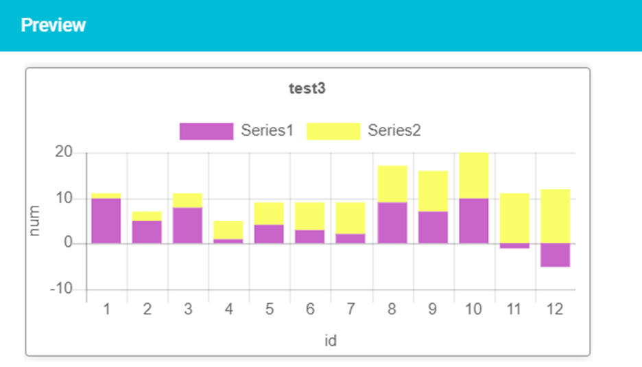
Figure 25