Validation Control
A validation control ensures that data entered a system meets specific criteria or rules, such as format, range, or completeness. It helps maintain data accuracy and integrity by flagging errors or inconsistencies before the data is processed or stored.
Working with a validation control:
- Create a form, as shown in Figure 1, by dragging validation controls.
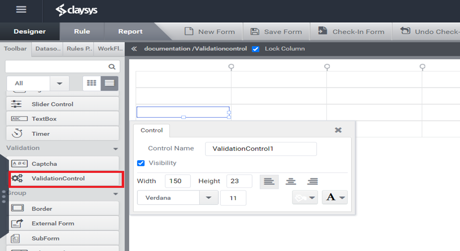
Figure 1: Designer
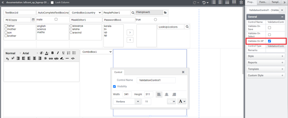
- After adding a validation control to the designer, it’s possible to change its control name, add remarks, and set Validate on save, Validate on Select & Validate on SP in the property panel (see Figure 2).
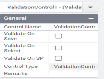
Figure 2: Properties tab
Validate on Save
Description
This option specifies whether validation should occur when the data is being saved or submitted. When set to “Validate on Save,” validation occurs at the point when the user attempts to save or submit the data.
How to Use:
1.Design Phase:
- Begin by adding all necessary controls to your form designer by dragging and dropping them.
- Access the properties tab of each control and navigate to the Validation section.
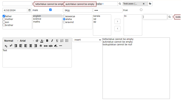
- Enable the “Is required” option and provide a required message. This message will be displayed next to the control if the user attempts to save the form without entering a value.

Figure3: Designer
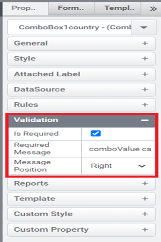
Figure4: Properties Tab-Validation
- Data Source Configuration
- Set up your form’s data source and configure the Insert operation to include all controls added via drag and drop.
- Begin by dragging and dropping all necessary controls onto your designer.
- Next, set up your form’s data source and configure the Insert operation, ensuring it encompasses all the controls you have added through drag and drop.
- In the validation control’s property tab, activate the “Validate on Save” property to trigger data validation during save operations.
- During preview or testing, attempt an insertion without data to observe the validation process in action, catching and addressing any validation errors that occur before finalizing the insertion.
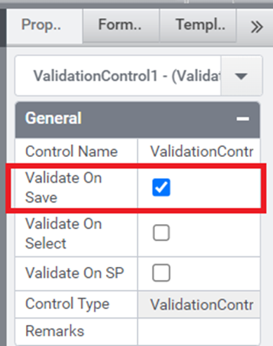
Figure3: Validate on save
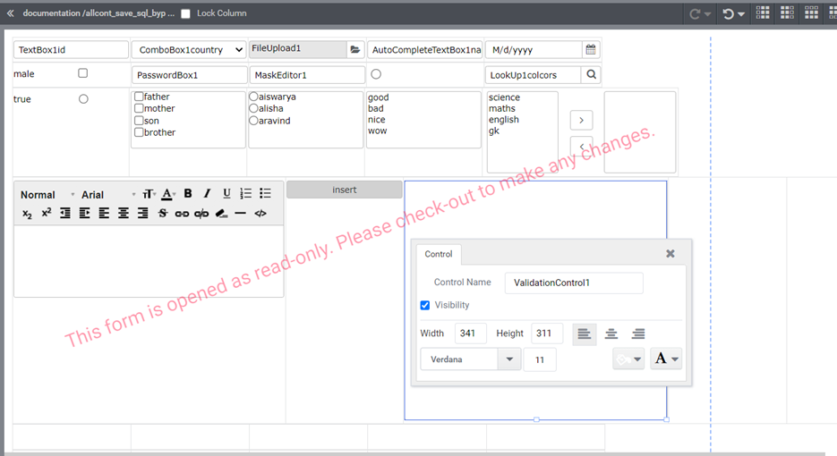
Figure 4: designer
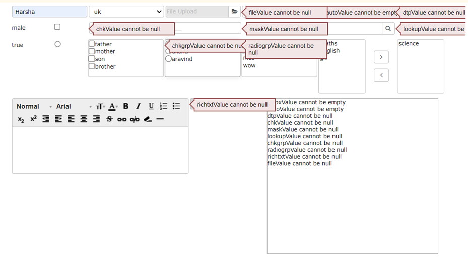
Figure 5: Preview
Validate on Select
Description: This option specifies whether validation should occur when the user selects an option or performs an action.
Validate on SP (Stored Procedure)
Description: This option specifies whether validation should occur when a stored procedure is executed or when a specific server-side action is triggered.
Validation Control Properties
Here’s the basic list of properties which can be used from rules.
Style.Width – Specifies the recommended width for the control.
Style.Height – Specifies the recommended height for the control.
Style.TextAlignmet – Indicates whether the text is aligned to the left, right, or center.
Style.Margin – Specifies the outer margin of the control.
Style.BoxShadow – Box Shadow values (horizontal offset, vertical offset, blur radius, color).
Style.TextFont – Specifies the font family for the control.
Style.FontSize – Specifies the font size.
Style.FontColor – Specifies the font color for the control.
Style.BackGroundColor – Specifies the background color for the control.
Style.Visibility – Display or hide the control.
Control Name: Validation Control
Group: Validation
| S.no | Property Name | Data Type | Description |
| General | |||
| 1 | Validate on Save | Boolean | This option specifies whether validation should occur when the data is being saved or submitted. |
| 2 | Validate on Select | Boolean | This option specifies whether validation should occur when the user selects an option or performs an action. |
| 3 | Validate on SP | Boolean | This option specifies whether validation should occur when a stored procedure is executed or when a specific server-side action is triggered. |
| 4 | Remarks | String | To make a comment or observation about the control for reference. |
| Style | |||
| 5 | Width | String | Sets the suggested width or thickness of the control. |
| 6 | Height | String | Sets the suggested height of the control. |
| 7 | Text Alignment | String | Specifies whether the text to be left-aligned, Center –aligned or right-aligned |
| 8 | Margin | String | Sets the edge or outer margin to the control. |
| 9 | Padding | String | Sets the padding of the control(left,Top,Right,Bottom) |
| 10 | Box Shadow | String | Set the box shadow of the control by giving horizontal and vertical shadow values, the needed blur distance, and the appropriate color. |
| 11 | Enable Custom Font | Boolean | Set a custom font by enabling “Enable Custom Font” and typing the font family needed. It helps to apply “font families,” which are not available in the property box. |
| 12 | Font | String | Sets the font face\style. |
| 13 | Font Size | String | Sets the font size. |
| 14 | Font Color | String | Sets a brush that describes the Text color of the control. |
| 15 | Background Color | String | Sets a brush that describes the Background color of the control. |
| 16 | Visible | String | Sets the visibility of the control while rendering. |
| 17 | Column Span | Integer | To merge the number of columns specified. |
| Reports | |||
| 18 | Control Report | Control Report will redirect to Reports tab that will display all the configurations, rules and data sources details associated to the selected control. | |
| Template | |||
| 19 | Inherit Template | Boolean | Enable this property to inherit control style from applied template |
| Custom Style | |||
| 20 | CSS Class | String | Allows you to add CSS class to your control to change the default formatting for any of our themes |
Table1: properties