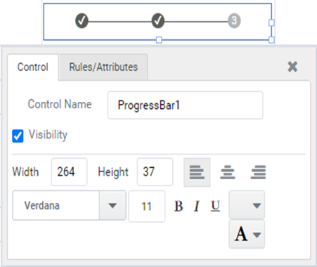
Progress Bar
A progress bar is a graphical control element utilized to represent the progress of a prolonged computer operation, like downloading, file transferring, or installing. Occasionally, the graphic is accompanied by a textual representation of progress in a percentage format. When the progress of the task cannot be determined, it could be expressed as a percentage in the progress bar.
Working with Progress Bar
1: Create a form with a ‘Progress Bar’, depicted below:
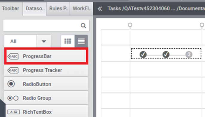
Figure1
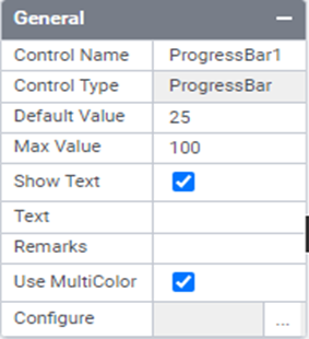
2: In the general properties section of the properties tab, users can set the Default Value, Max Value, Show Text, Text, and Use MultiColor options.
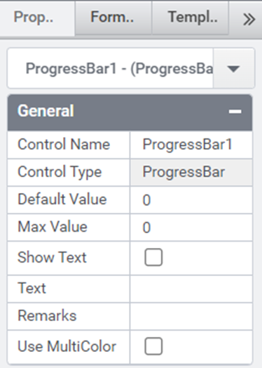
Figure2: General properties
- Default Value and Max Value
The default value and maximum value of the progress bar are used to visually represent the progress of a single criterion.
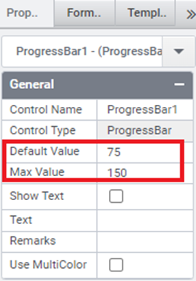
Figure 3
Example: The Default value associated with the control is set to 75, while the maximum value in the progress bar is 150.
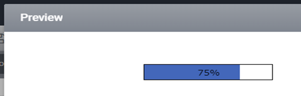
Figure 4: Default Value and Max Value
- Show Text and Text
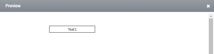
Figure 5
Example: Enable the “Show Text” option and input the text as “Test1”.

Figure 6: Preview_ Show Text and Text
- Use MultiColor
When the multicolor option is enabled, a configuration option will appear:
- Click on the settings icon in the configuration column.
- Upon clicking, the progress bar configuration window will appear.
- In the configuration window, we can set the Progress Color, Font Weight, Font Color, Percentage, and Text.
- After adjusting according to our requirements, click the ‘OK’ button.
The configuration of a muExample: Enable the “Show Text” option and input the text as “Test1”.
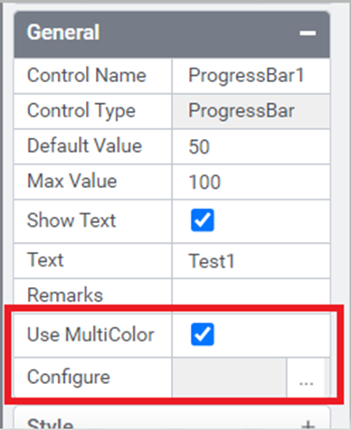
Figure 6: Preview_ Show Text and Text
- Use MultiColor
When the multicolor option is enabled, a configuration option will appear:
- Click on the settings icon in the configuration column.
- Upon clicking, the progress bar configuration window will appear.
- In the configuration window, we can set the Progress Color, Font Weight, Font Color, Percentage, and Text.
- After adjusting according to our requirements, click the ‘OK’ button.
The configuration of a multicolor progress bar is used to visually represent the progress of multiple criteria.

Figure 7
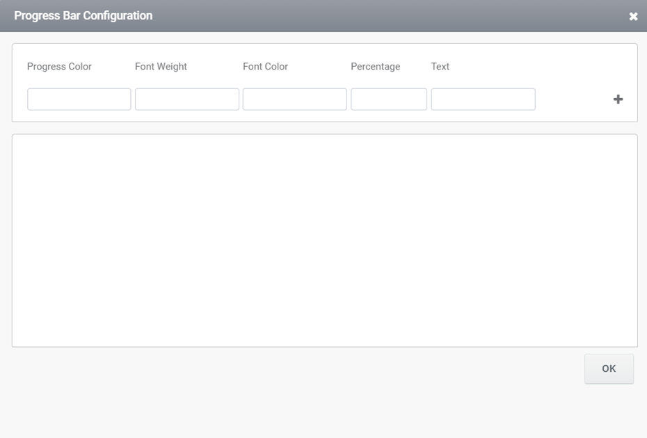
Figure 8: Progress bar configuration window
In the progress bar configuration window, the total of the percentages should equal 100. If the sum of the percentages is not 100, a warning message will appear, indicating that the data cannot be saved until the percentages are adjusted to reach a total of 100.
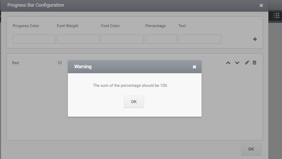
Figure9: Warning message
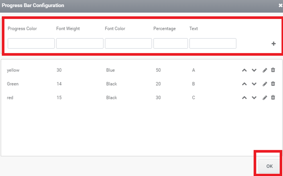
Figure 10
After clicking the ‘OK’ button, the applied configuration values will appear in the progress bar.
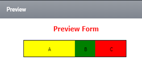
Figure 11: Preview_multicolor
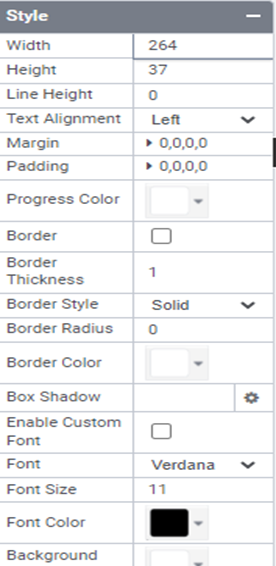
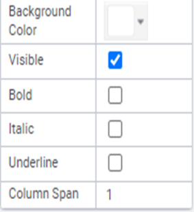
3: In the Properties Tab, users have the ability to adjust parameters such as width, height, progress color, border color, border thickness, box shadow, etc. (See Figure 12)
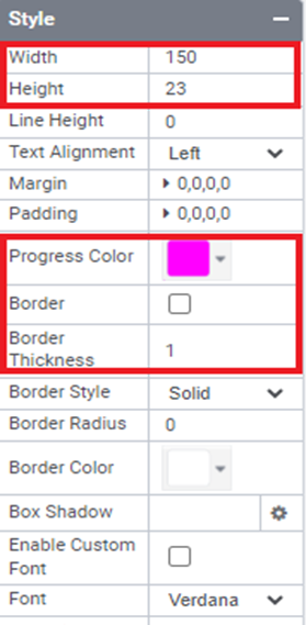
Figure 12
Progress bar Properties
Here’s a fundamental list of properties that can be utilized within rules.
Value – To retrieve or assign the Current Value linked with the control.
Style.Width – Specifies the recommended width of the control.
Style.Height – Specifies the recommended height of the control.
Style.LineHeight – Specifies the recommended line height of the progress bar.
Style.TextAlignmet – Specifies whether the text should be left-aligned, right-aligned, or centered.
Style.Margin – Specifies the outer margin of the control.
Style.BoxShadow – Box Shadow values consist of four parameters: horizontal shadow, vertical shadow, blur distance, and color.
Style.progressColor Specifies the border color of the control.
Style.BorderThickness- Thickness of the progress bar border.
Style.BorderStyle – Specifies the border styles.
Style.BorderRadius – Border radius of the progress bar.
Style.BorderColor – Specifies the border color for the control.
Style.TextFont – Specifies the font family for the control.
Style.FontSize – Specifies the font size.
Style.FontColor – Specifies the font color for the control.
Style.BackGroundColor – Specifies the background color for the control.
Style.Visibility – Toggle the visibility of the control.
Style.Bold- Activate this option to apply bold formatting to the text font.
Style.Italic- Activate this option to render the text font in italics.
Style.Underline- Activate this option to underline the text font.
Text- Specifies the text content of the progress bar.
TabIndex- Specifies the tab index of the progress bar.
Designer Properties
Here is the list of available properties in the progress bar from the designer:
Control Name: Progress Bar
Group: Standard
| S.no | Property name | Data type | Description | ||||
| General | |||||||
| 1 | Text | String | To set the text associated with the control. | ||||
| 2 | Default Value | Integer | Current value associated with the control. | ||||
| 3 | Max Values | Integer | Maximum value in the progress bar. | ||||
| 4 | Show Text | String | Show\Hide progress | ||||
| 5 | Text | String | Set the text associated with the control | ||||
| 6 | Remarks | String | To make a comment or observation about the control for reference. | ||||
| 7 | Use Multicolor | String | Enable\Disable progress bar styling | ||||
| Style | |||||||
| 8 | Width | String | Sets the suggested width or thickness of the control. | ||||
| 9 | Height | String | Sets the suggested height of the control. | ||||
| 10 | Line Height | String | Sets the suggested Line height of the control. | ||||
| 11 | Text Alignment | String | Specifies whether the text to be left-aligned, Center –aligned or right-aligned | ||||
| 12 | Margin | String | Sets the edge or outer margin to the control. | ||||
| 13 | Padding | String | Sets the padding of the control( left, top, right, bottom) | ||||
| 14 | Progress color | String | Sets the progress color of the control | ||||
| 15 | Border | String | Show or Hide Border | ||||
| 16 | Border Thickness | String | Thickness of progress bar border. | ||||
| 17 | Border Style | String | Specifies the border style | ||||
| 18 | Border Radius | String | Radius of the progress bar border | ||||
| 19 | Border color | String | Sets the border color of the control. | ||||
| 20 | Box shadow | String | Show box shadow values(Horizontal shadow, vertical shadow, blur shadow , color) | ||||
| 21 | Enable Custom font | String | Enable custom font family | ||||
| 22 | Font | String | Sets the font face\style. | ||||
| 23 | Font Size | String | Sets the font size. | ||||
| 24 | Font Color | String | Sets a brush that describes the Text color of the control. | ||||
| 25 | Background Color | String | Sets a brush that describes the Background color of the control. | ||||
| 26 | Visible | Boolean | Sets the visibility of the control while rendering. | ||||
| 27 | Enable | Boolean | Sets the accessibility of the control during rendering. | ||||
| 28 | Bold | String | To make the control text Bold. | ||||
| 29 | Italic | String | Italicize the control text. | ||||
| 30 | Underline | String | Enable this option to render the text font in underline. | ||||
| 31 | Column Span | Integer | To merge the number of column specified. | ||||
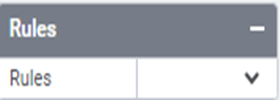
| Rules | |||||||
| 32 | Rules | After selecting the control, if user clicks Rules tab it will be expanded and displays a Rules property. Create Rule can be selected from a drop-down list. On clicking the Create Rule link button will navigate the user to the Rules Engine. The same control will be added as a trigger by default to execute the Rule. | |||||
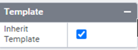
| Template | |||||||
| 33 | Inherit Template | Boolean | Enable this property to inherit control style from applied template | ||||
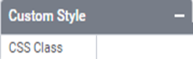
| Custom Style | |||||||
| 34 | CSS Class | String | Allows you to add CSS class to your control to change the default formatting for any of our themes | ||||
| Reports | |||||||
| 35 | Control Report | Control Report will redirect to Reports tab that will display all the configurations, rules and data sources details associated to the selected control. | |||||
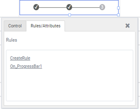
Quick Action Menu
Progress bar will contain two Quick action menus (Control, Rules/Attributes)